“To the Victor Belong the Oilsâ€
Established in 2019, Oio Lab is a brand of skincare products produced and available in Poland. Based on natural ingredients, consisting of organic, cold-pressed oils, and plant extracts obtained using innovative methods -- like enzymatic extraction or supercritical carbon dioxide extraction, stuff like that -- Oio Lab offers, at the moment, four facial treatment oils. Founded by former lawyer, Joanna Ryglewicz, who developed an interest in cosmetics after importing products from Paris to Poland to help sustain her law studies at the time, Oio Lab has been gathering quick interest from the press, including Vogue Poland, and is looking to expand its market to the UK and U.S.. Their identity and packaging have been designed by Oslo, Norway-based Hugmun.
The brief was to ensure their traditional knowledge and wisdom of rituals, combined with advanced ingredients, was reflected in an innovative and artistic approach to appeal to their conscious consumers. We were responsible for graphic design development, including packaging identity creation. We art directed 3 photoshoots, finessed the logo lines and shapes, developed and designed all packaging, re-skinned the website and produced all online and print materials, including merchandise such as; postcards, bags, stickers, newsletters, presentations. We continue to act as brand-guardians for ongoing work.
Hugmun project page
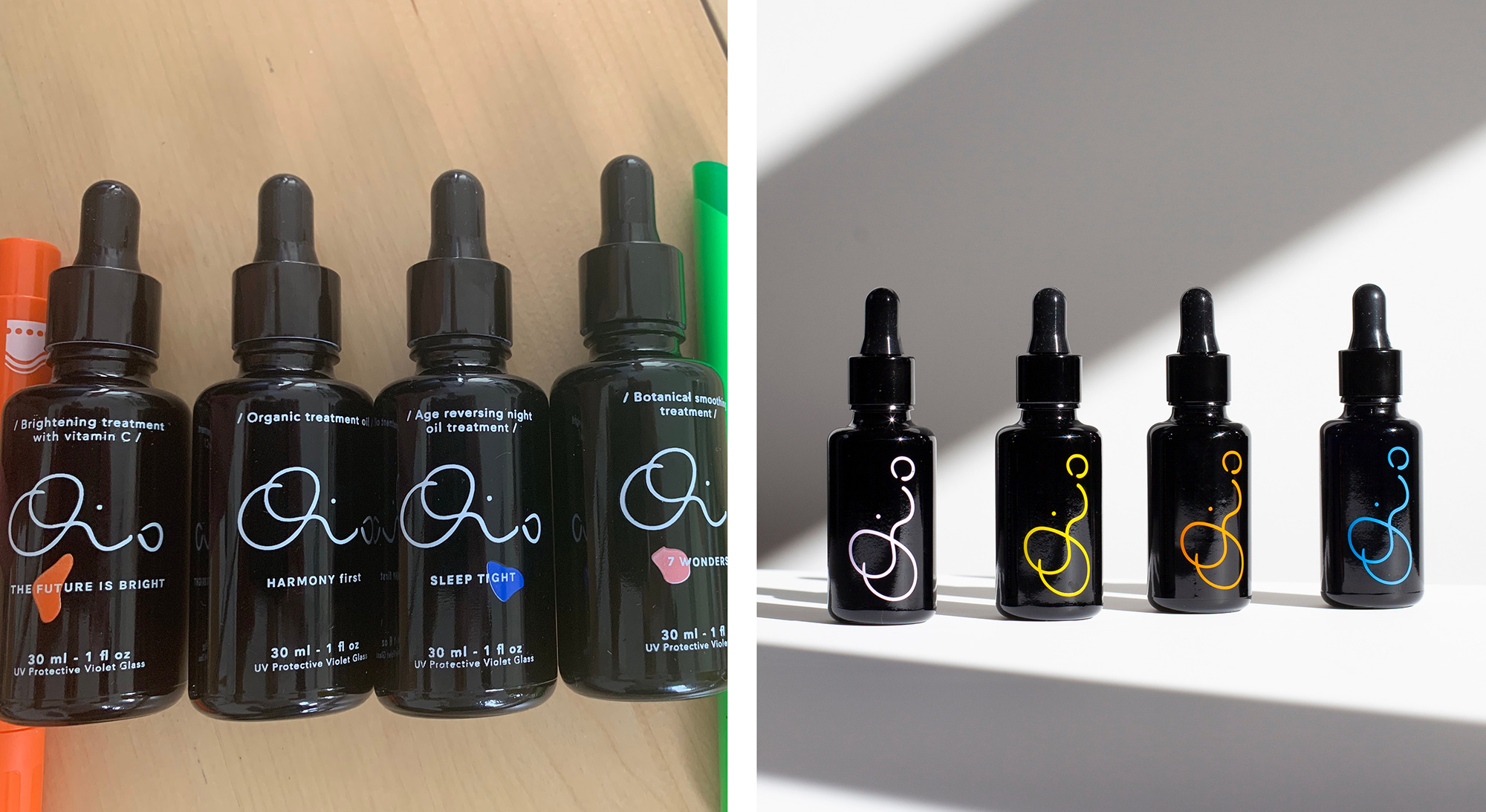
The original logo was NOT designed by Hugmun but they cleaned it up and it goes to show how important execution is -- not that it needs much proving around these parts but it's still nice to see a clear-as-day example. The original version was wonky and had no flow, with odd bumps everywhere. The new logo is smoother and the lines have a much more graceful flow. To be honest, I'm not sure I would read "Oio" without knowing the product is called "Oio", as that "i" is pretty abstract, but once you know, I think it's a lovely logo that feels organic and hand-made. I really like the exaggerated large size of the "O", long curl of the "i", and far placement of the "o". There is something pleasant about it and, more importantly, it has the personality and distinctiveness that the clinical sans serif trend simply can't achieve.
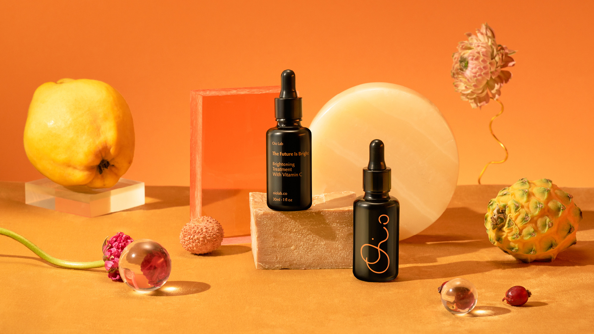
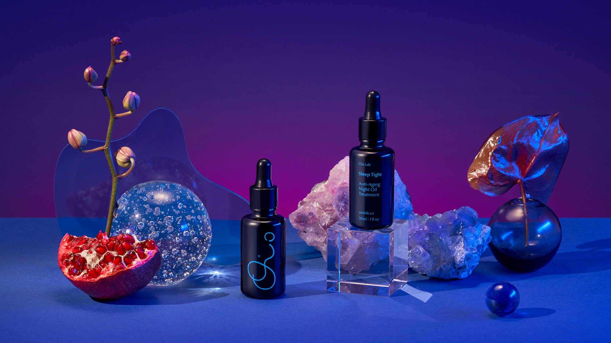
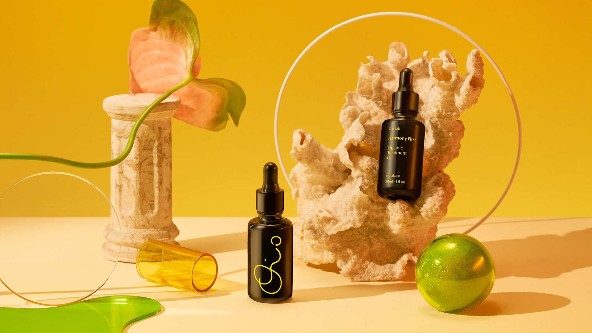
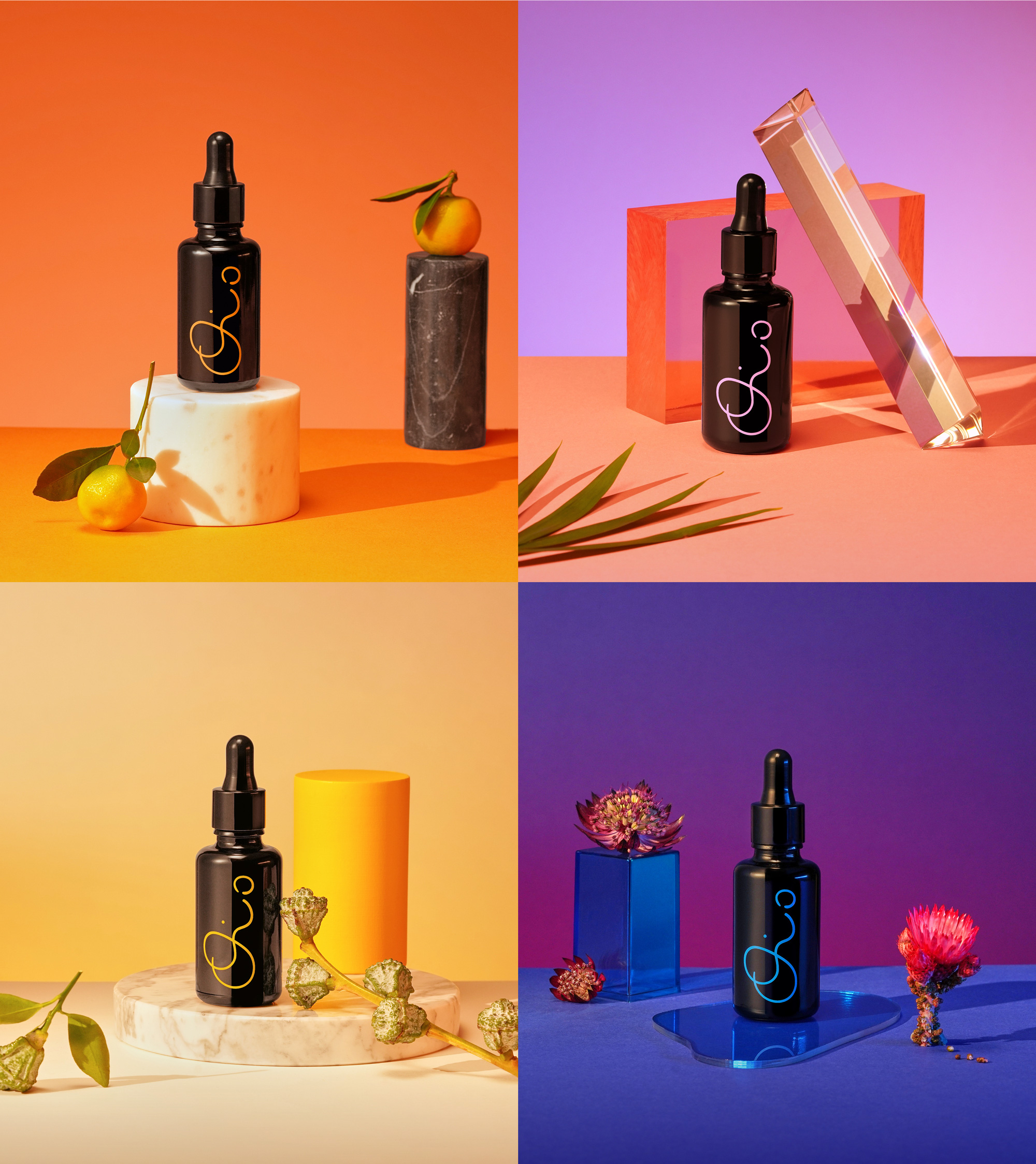
Abstract, modern art and use of vivid colors was a request from the client. A fusion between magical rituals and symbolic plants was our inspiration, to insure we showcase the superior ingredients but in a minimalistic, playful and artistic way - which is especially demonstrated in the packaging design and creative photography. Vibrant orange is the core brand color, to reflect warmth and strength. Colourful blobs embody the oil substance of their products and act as brand devices, flowing within the logo and springing to life in animation. Oio is 100% honest about their products ingredients, so whilst the oils are stored in violet glass to preserve vitality, we also created animations with transparent 3D bottles to further exemplify this.
Hugmun project page
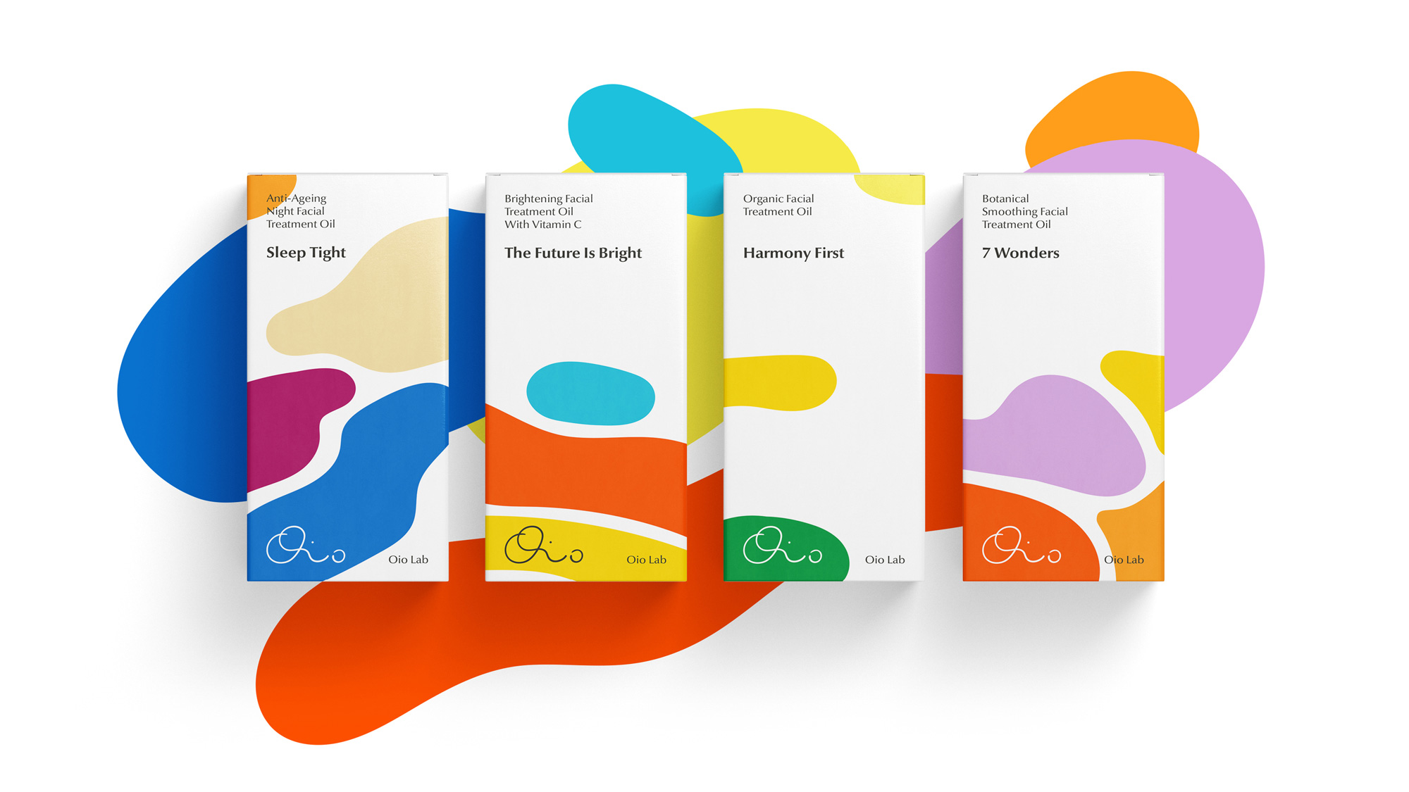
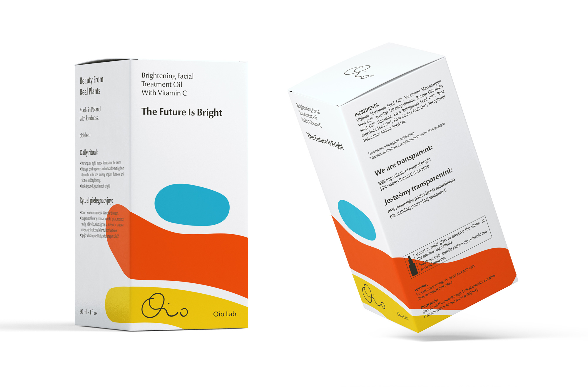
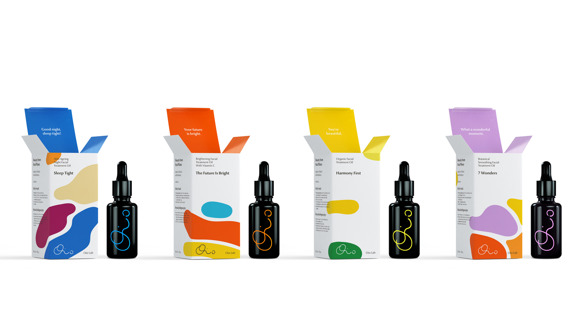
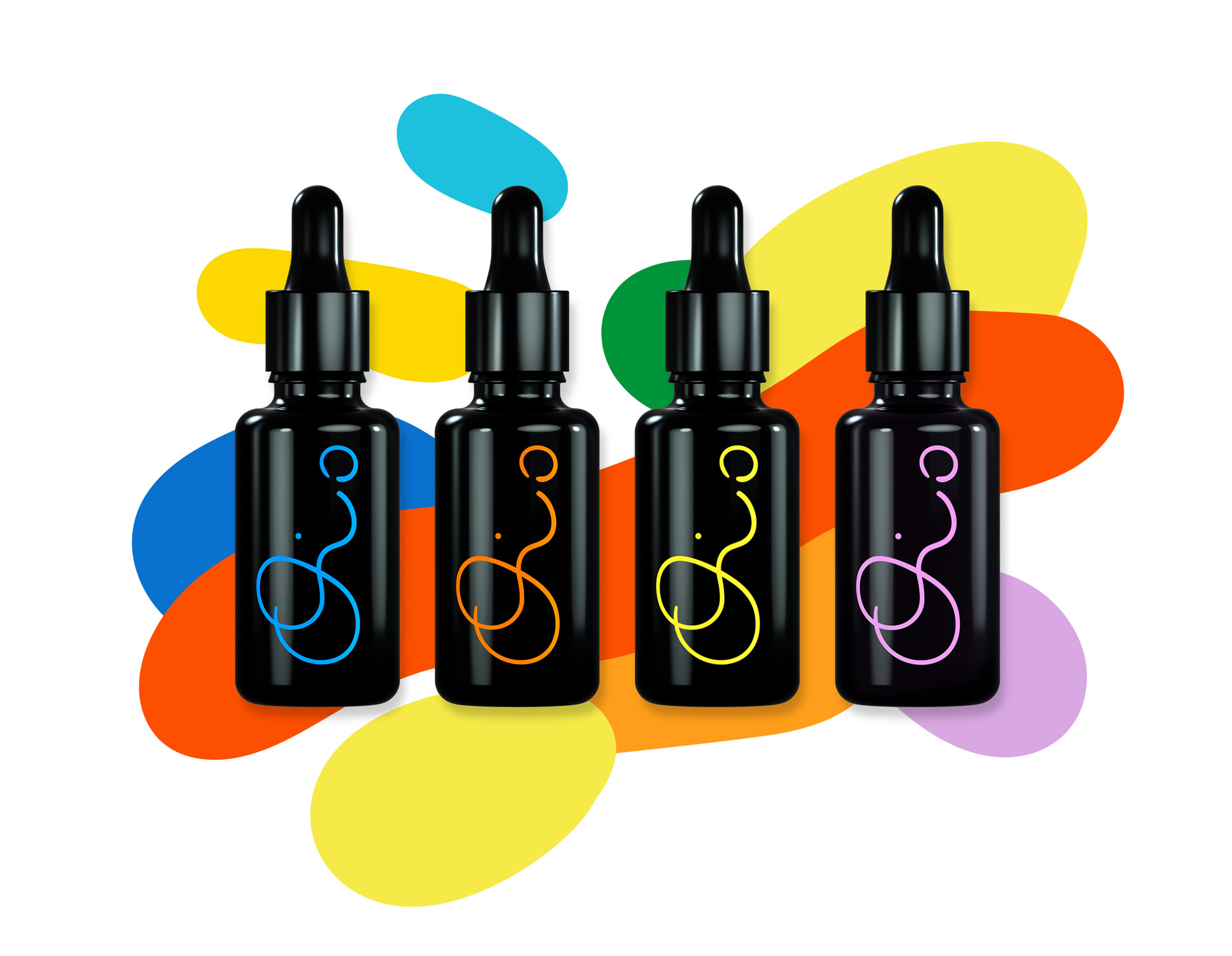
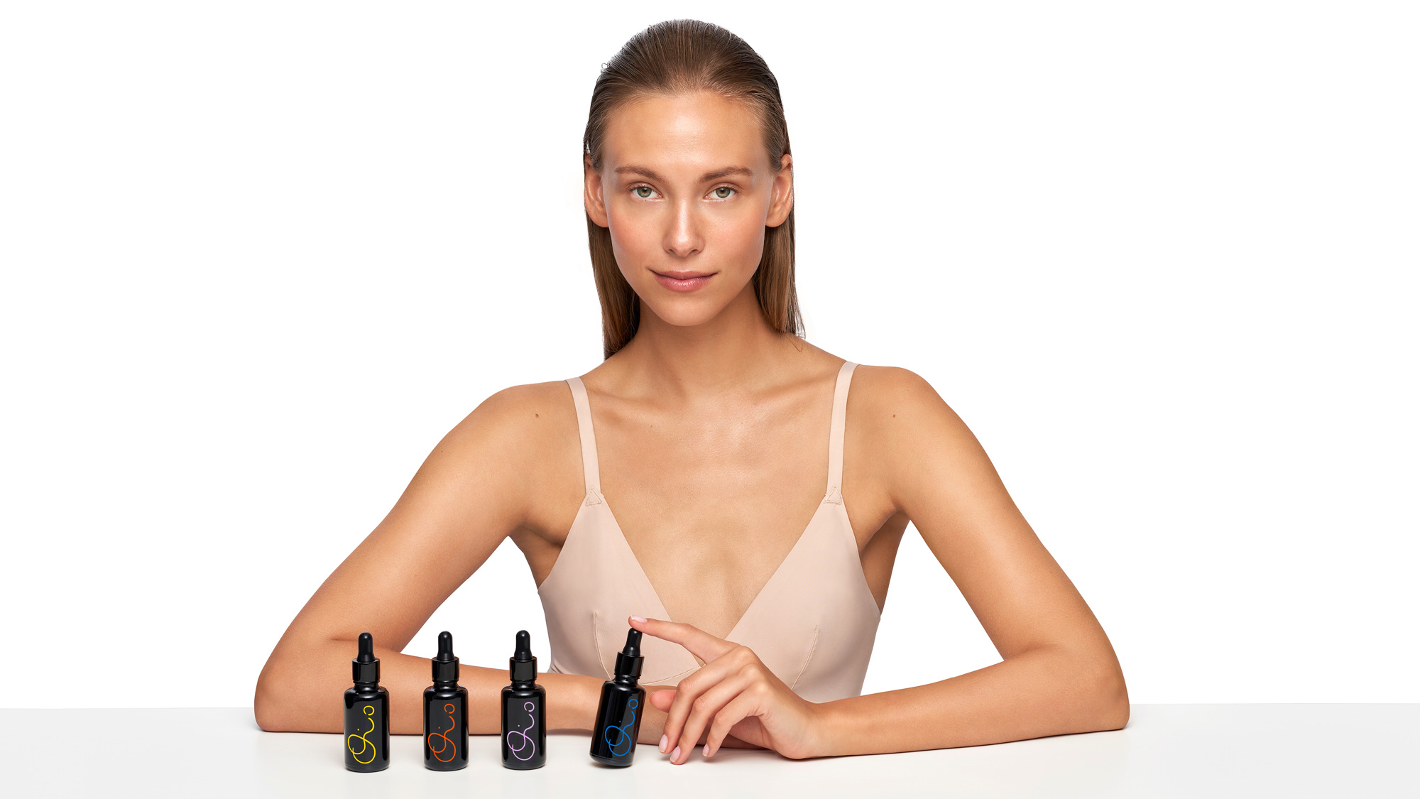
As with the logo, the design of the little bottles show how big a difference design subtlety can make. The old bottles were fine with the logo centered along with some small type and tiny blobs but the new bottles with the logo on its side, in different colors, and nothing else is real fine. The size and placement of the logo makes the bottles feel more unique and high-end. The little blobs that appeared on the old bottles have been expanded into a system of colorful interlocking blobs that shift configurations and colors in the outer boxes, which now have all the information that was previously crammed into the front of the bottles -- I assume the budget has increased to now produce the boxes and print on both "sides" of the bottle, allowing for the luxury of keeping the front of the bottle clear of additional info. The blobs are paired with a classic cosmetics move of a high-contrast sans serif that, as a secondary element, looks pretty good.
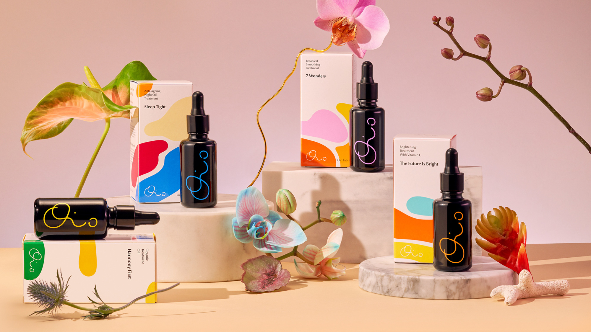
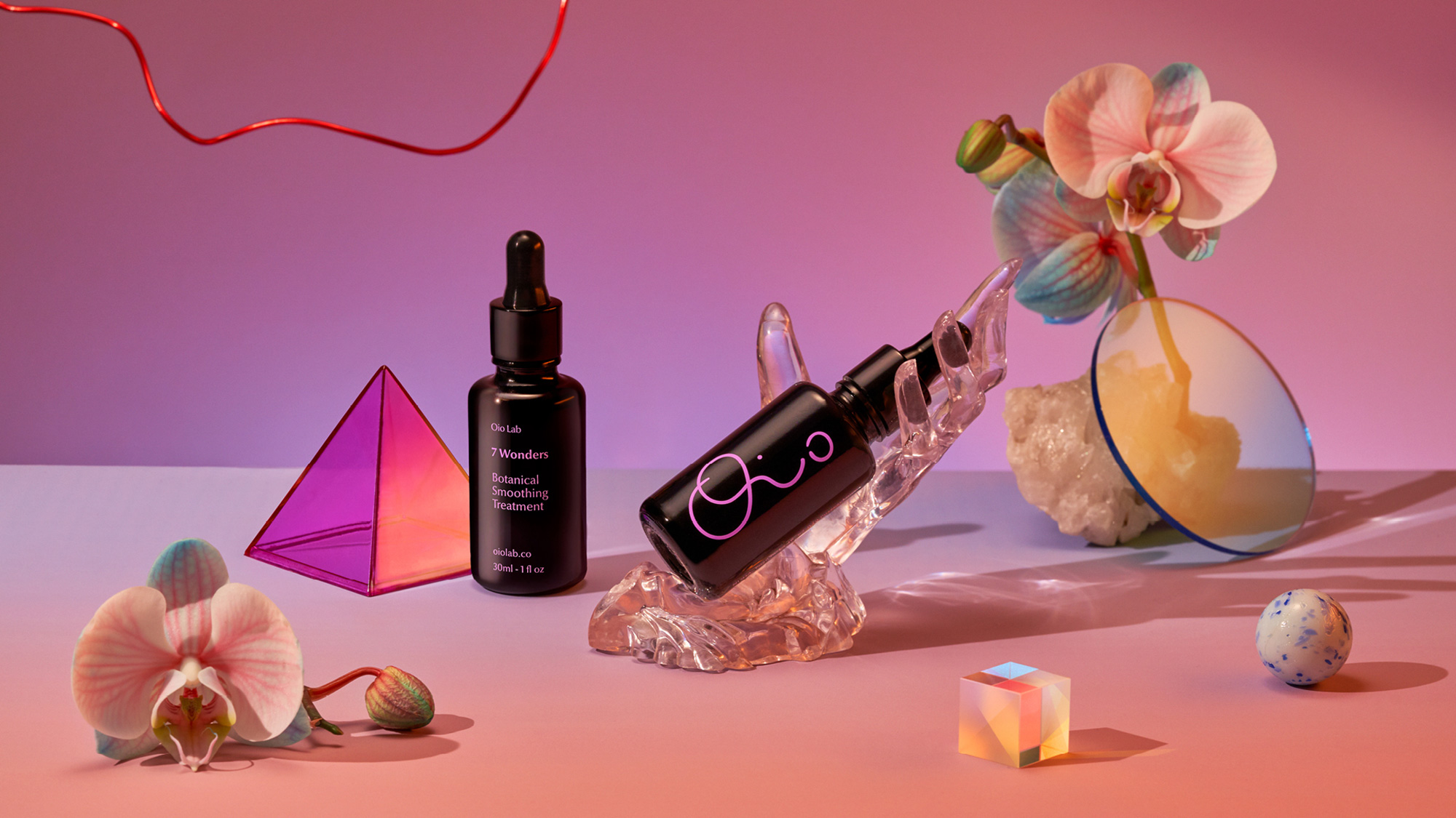
Overall, and accentuated by its slightly surrealist presentation, the product has a groovy, high-end appeal that sets it apart from both the big mainstream cosmetic brands as well as the more earthy organic brands, landing somewhere in the middle with a dash of magic and science.
|
 | Tweet