“From Where’s Gut Studio, Welcome Stranger, and Reâ€
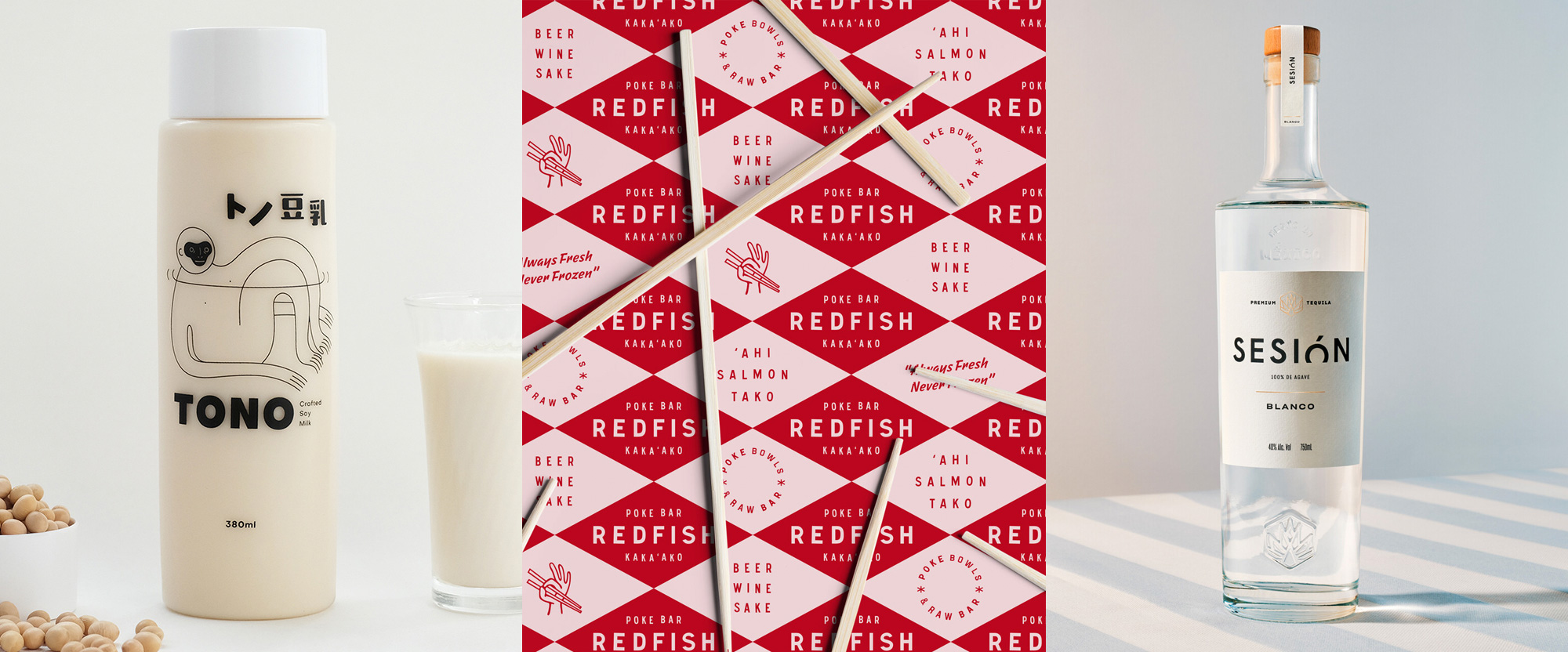
A whole day's worth of sustenance this week -- soy milk for breakfast, poke for lunch, and tequila for dinner -- with work from Kuala Lumpur, Honolulu, and Sydney.
Tono by Where's Gut Studio
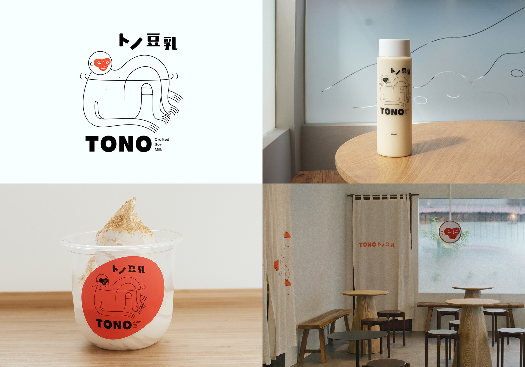
Tono is a range of soy milk products sold at a brick and mortar store-slash-dessert-joint in Petaling Jaya, Malaysia. The identity, designed by Kuala Lumpur, Malaysia-based Where's Gut Studio, brings to life the made-up mythology of Tono, a sloth-like-maybe-human-I-don't-want-to-make-wrong-assumptions-being depicted in a strange but alluring illustration. The thin line-art and how the legs and arms blend into each other is kind of groovy and the red/orange face, while also on the slightly creepy side, adds a bold spark of color. The fragility of the character is nicely offset by the bold and simple wordmark. I don't imagine this being a super popular project in the voting but I thought it was unique enough to point out. See full project
Redfish by Welcome Stranger
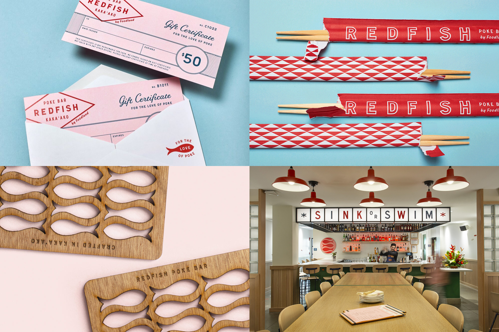
Redfish is a poke restaurant in Honolulu, HI -- owned by Foodland, a supermarket chain with 32 stores in Hawaii -- serving fresh, customizable poke bowls and hearty shared plates with beer, wine, and sake. Their identity, designed by local firm Welcome Stranger, is "inspired by vintage Foodland photos and historical supermarket ephemera", including the diamond pattern found in the facade of Foodland's first store that opened in 1948. From there, the identity builds a number of badges, type treatments, and illustrations all with a vintage Americana flair but with some contemporary touches that move it beyond pastiche. The applications are not necessarily jaw-dropping but the full visual language (best seen at the project link) is fairly satisfying and the restaurant's brand promise of "Warm Rice, Cold Beer, and Raw Fish" sounds like something I could get on board with right now. See full project
Sesión by Re
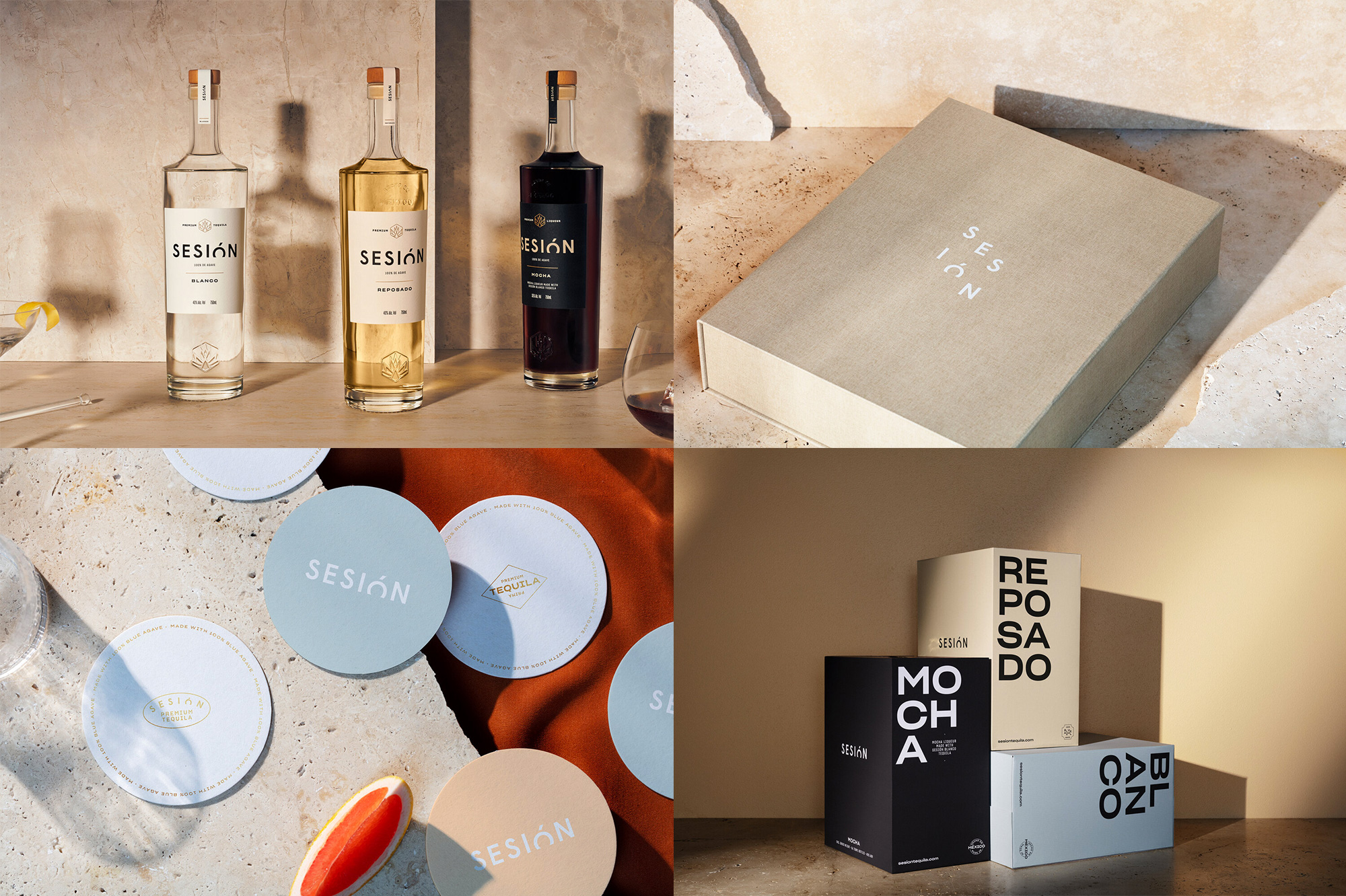
Sesión is a brand of premium tequila produced in Jalisco, Mexico, and sold in Australia, where vodka and gin lead the spirit category. The identity and packaging, designed by Sydney, Australia-based Re, positions tequila as the slow-sipping, mature spirit that it is (as opposed to its let's-do-shots-and-get-drunk reputation where you can't really savor it) with a clear high-end aesthetic from logo to bottle. The wordmark is a simple sans serif with the "Ó" in it dipping as if it were a sunset, which is not an entirely original move but the presence of the accent over the "O" gives it a little extra flair. The one thing I don't quite like is the agave icon, which doesn't feel as refined as the logo, the rest of the typography, or the slick bottle silhouette. The boxes with the big type broken in pairs... I'm not sure is quite right for the brand but it definitely looks cool. And I'm hugely, deeply, droolingly intrigued by the Mocha variety. See full project
|
 | Tweet