“Everything’s A-CMY-OKâ€
(Est. 2017) "Printer’s Ale Manufacturing Co. is a 20-barrel system production brewery & taproom based in Carrollton, Georgia. We are brewing beer with the same precision and love for making things that our family has shared for generations--both as printers and as brewers. We are tinkerers, entrepreneurs, and dreamers. Allow us to introduce you to the family trades."
Design by
CODO (Indianapolis, IN)
Related links
CODO project page
CODO Q&A with PAMCo founder Greg Smith
Relevant quote
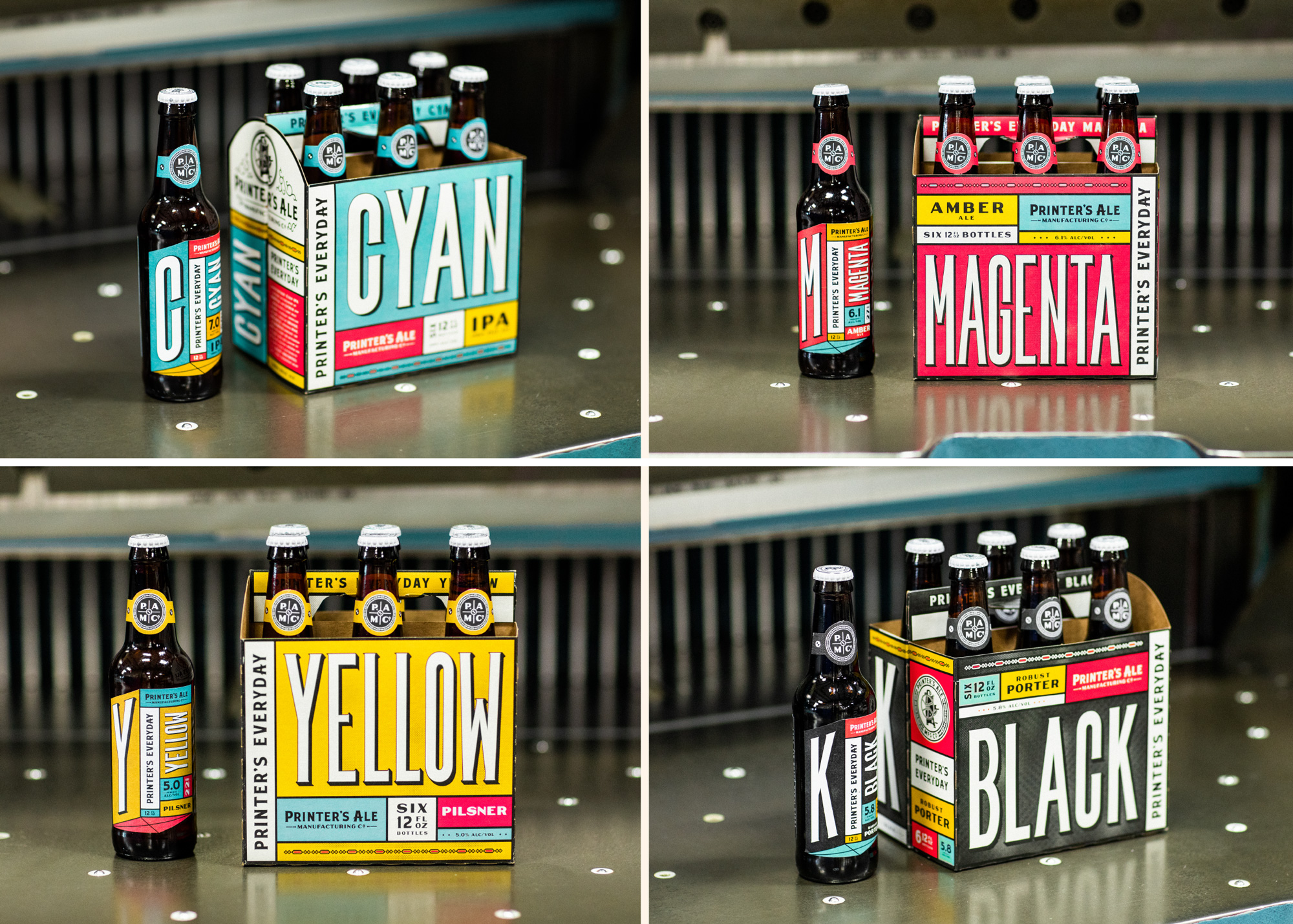
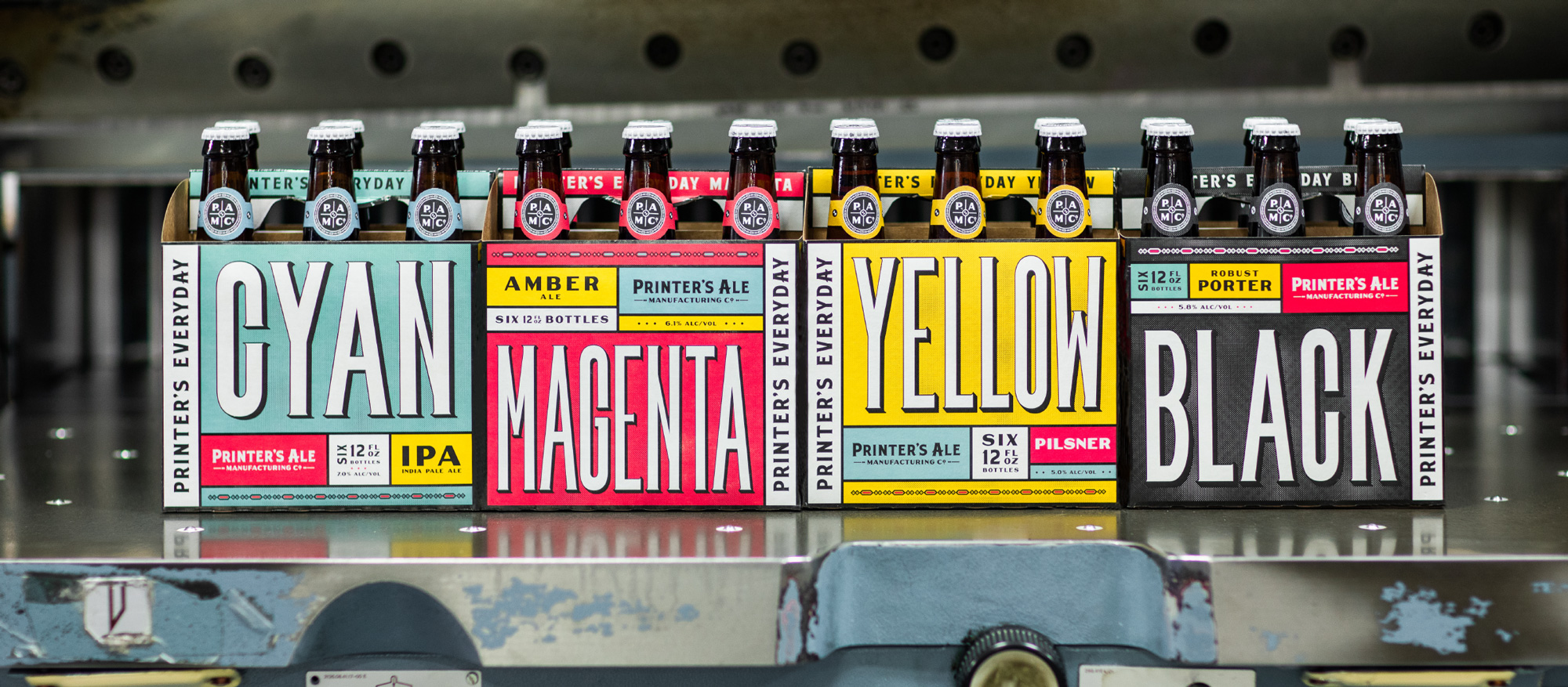
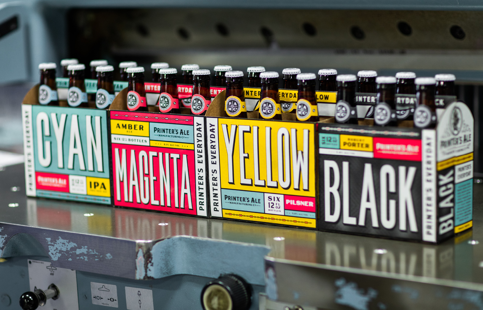
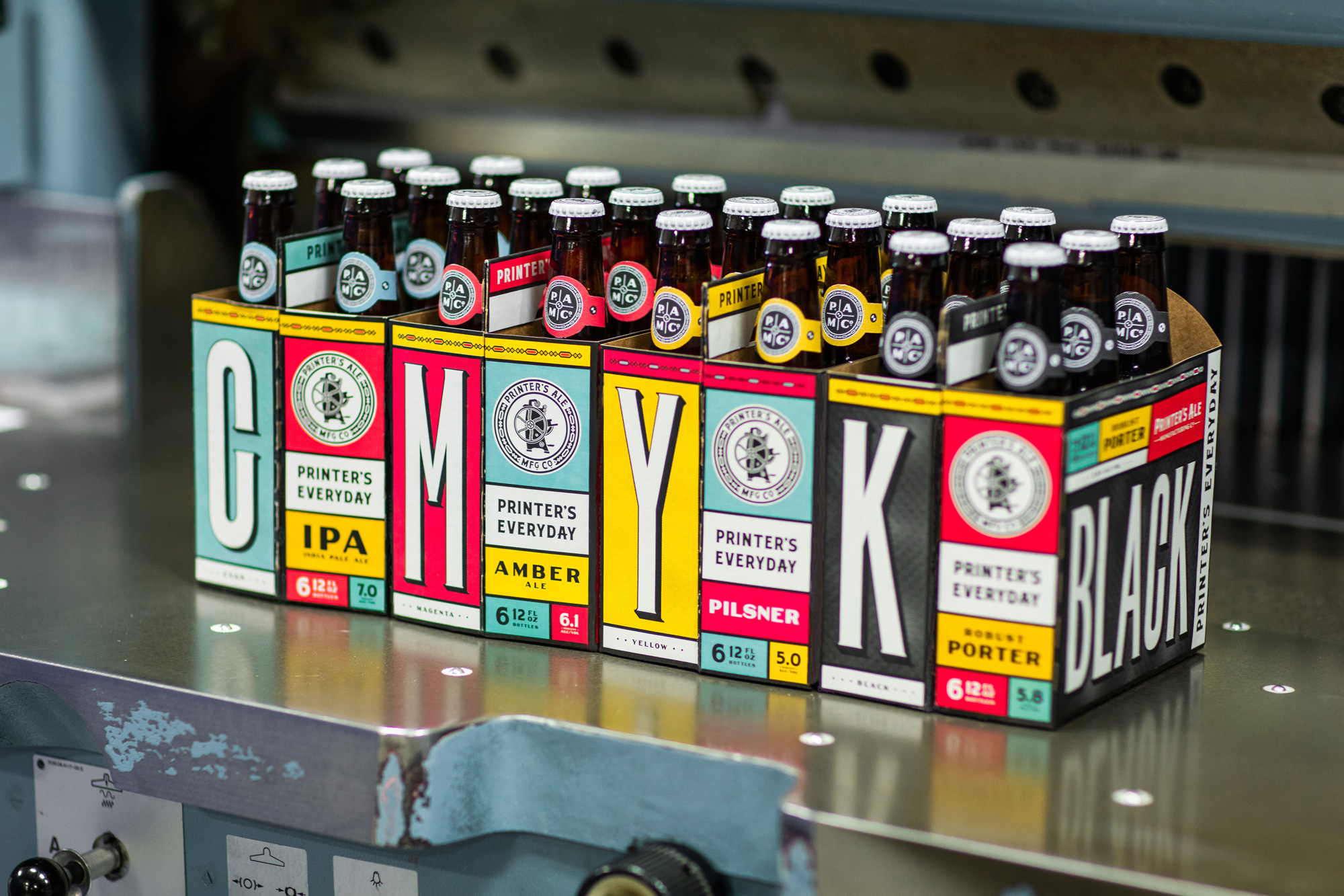
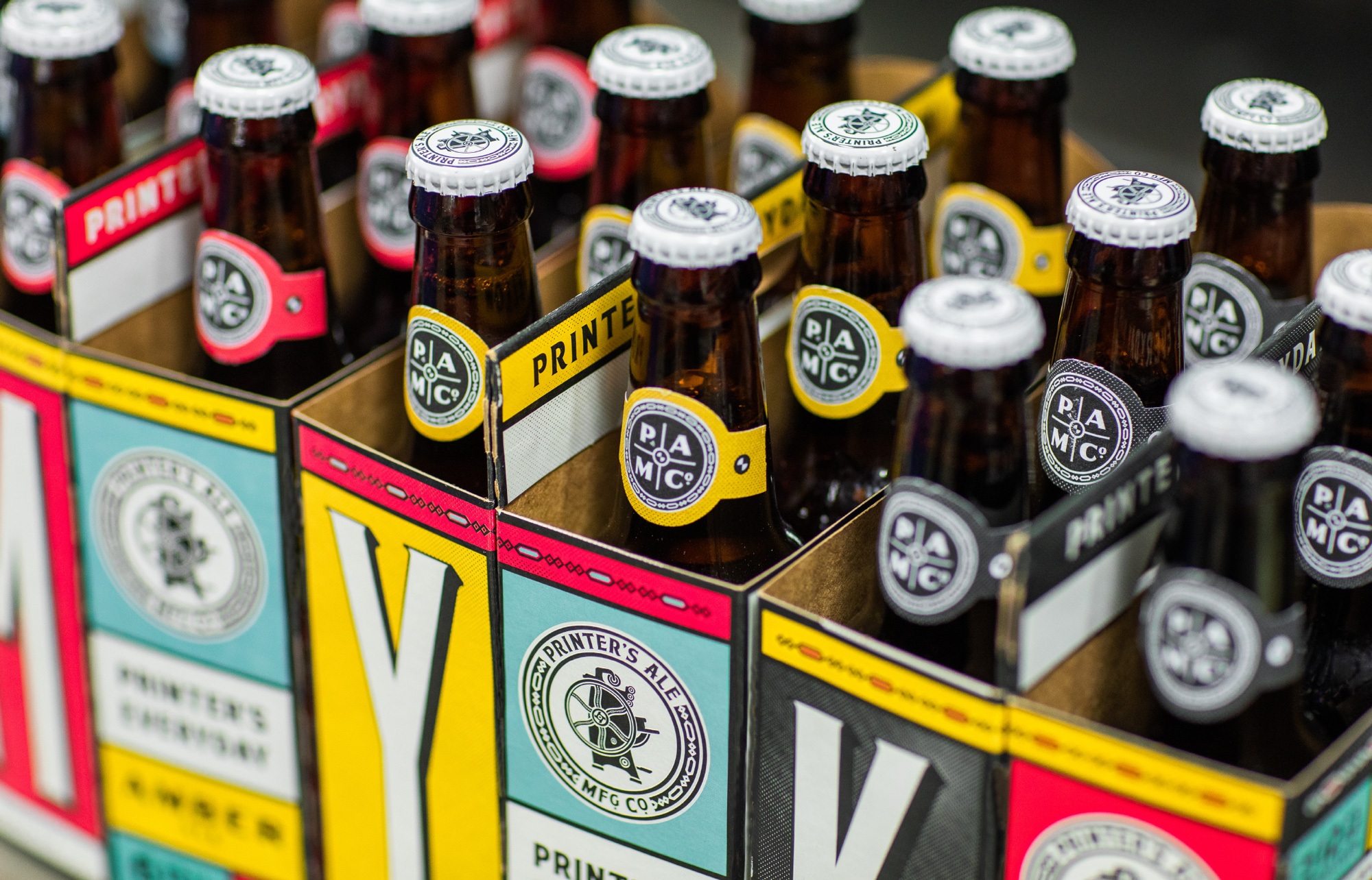
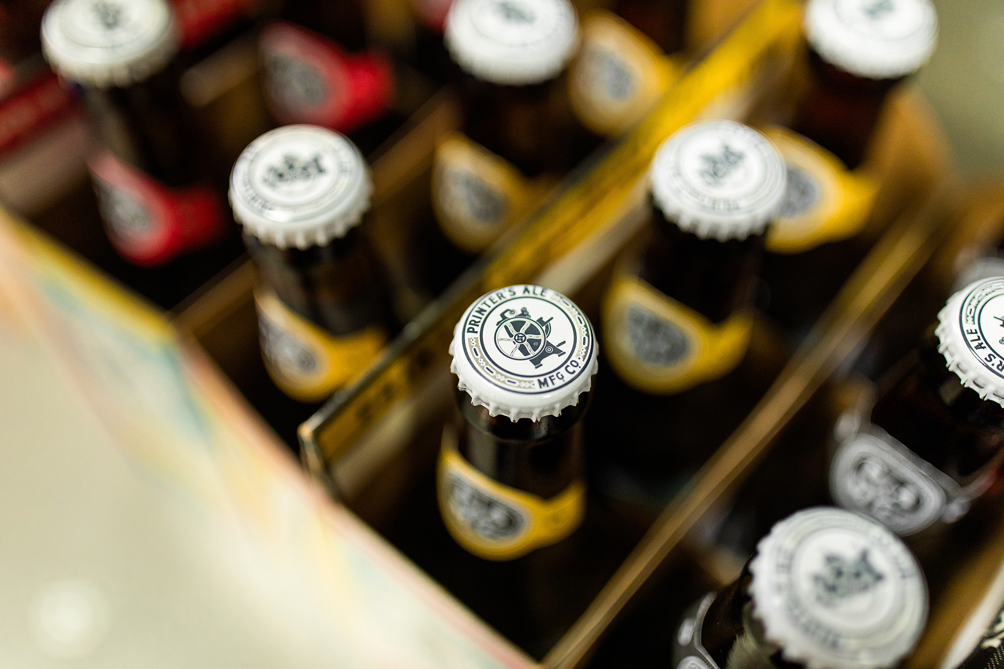
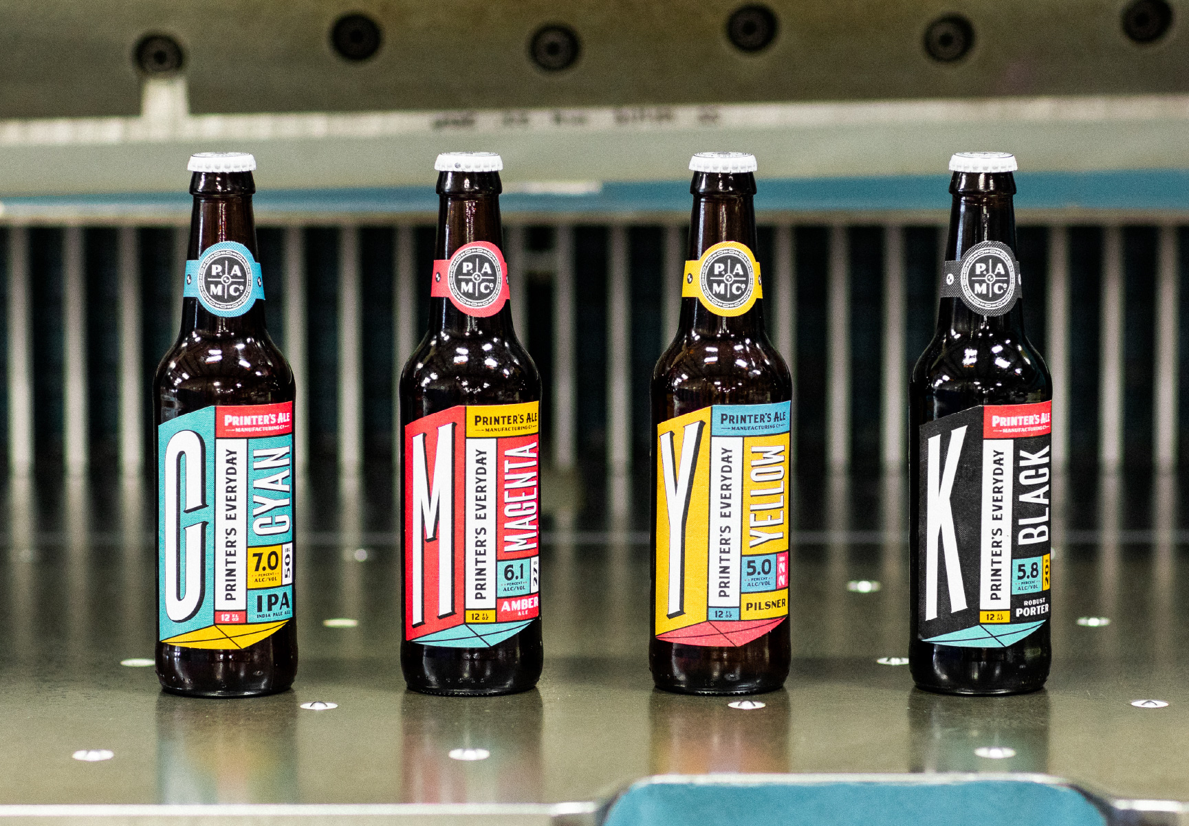
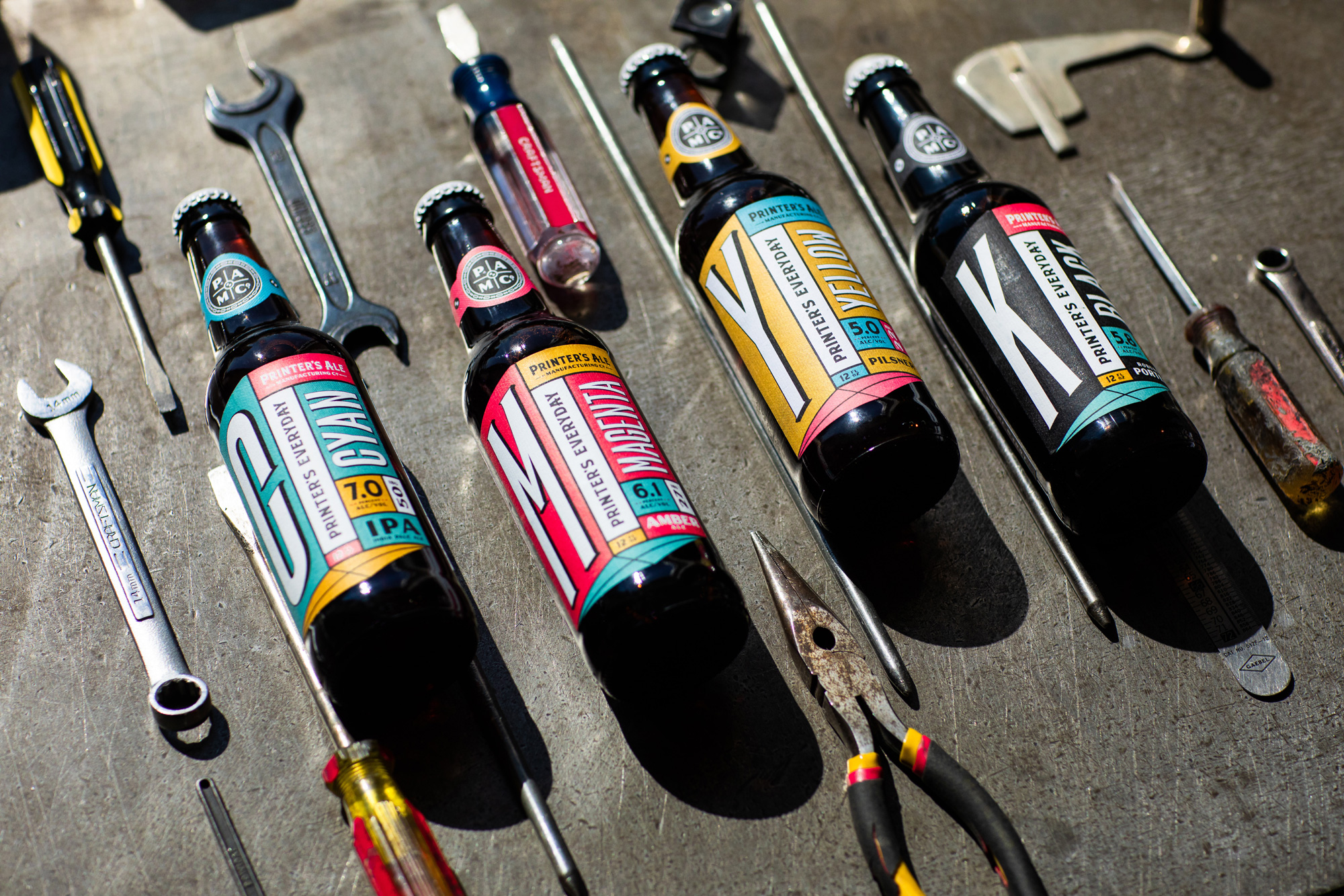
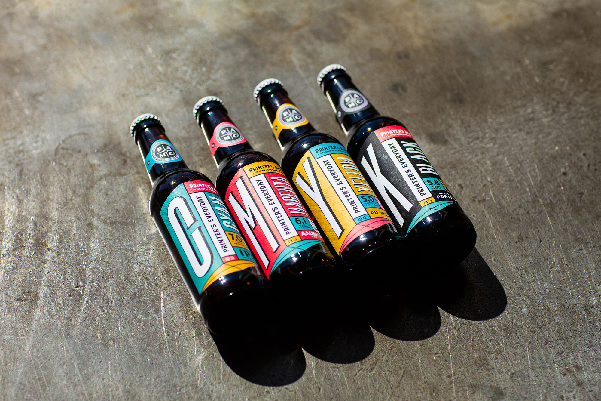
We worked with Printer’s Ale to develop a strong identity, marrying a beautiful old Jobber press with graphic novels and just a skosh of punk rock. We designed his core lineup of beers to stand out in a crowded Georgia market; Cyan, Magenta, Yellow and Black are named after the inks that print shops use every day.
Printer’s Ale’s branding draws heavy inspiration from the beautiful visual vocabulary or printing—registration marks, halftones and all the lovely imperfections that can arise through the process if putting ink to paper.
Images (opinion after)
Opinion
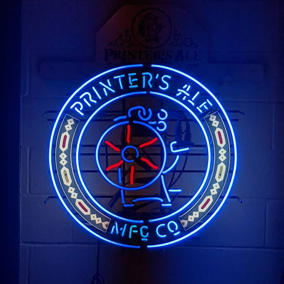
The logo is a little too heavy on the vintage aesthetic for my taste but the serif part of it is indeed nice — I think it’s the high-contrast “MANUFACTURING CO.†that throws me off, looking like an old diner. The drawing of the press is charming but maybe too detailed. The secondary marks are alright but there is something weird about the diamond-y dingbats — I keep thinking of Northwest Coast art for some reason. Nonetheless, the logo is just an excuse to get to the packaging, which is all kinds of visual and design fun. When a printer launches a brewery with beers named Cyan, Magenta, Yellow, and Black, there is nowhere to go but full CMYK and while this could have been done in some kind of minimalist, sans serif, too-cool-for-school design-y approach, I love how ornate and exuberant it is, with no space anywhere left untouched. I don’t think there is any significant point in overthinking this or waxing philosophical about it, it’s just plain fun and on point.
|
 | Tweet