“Put Your Test Foot Forwardâ€
Established in 1976, NI (National Instruments) develops automated test and automated measurement systems that help engineers across various industries, from automotive to electronics to energy, by providing software-connected systems and hardware. To be perfectly honest I am not 100% clear about what they do but I think I get it: They build the things that allow people that build bigger things to build in systems that are constantly testing and monitoring those things with the things in the things. Clearer, right? Based in Austin, TX, NI has over 7,300 employees and works with more than 35,000 customer accounts worldwide. Earlier this month, as part of a repositioning to "speak to the needs of larger enterprises while remaining true to the community of passionate and brilliant engineers", NI introduced a new identity designed by New York, NY-based Gretel.
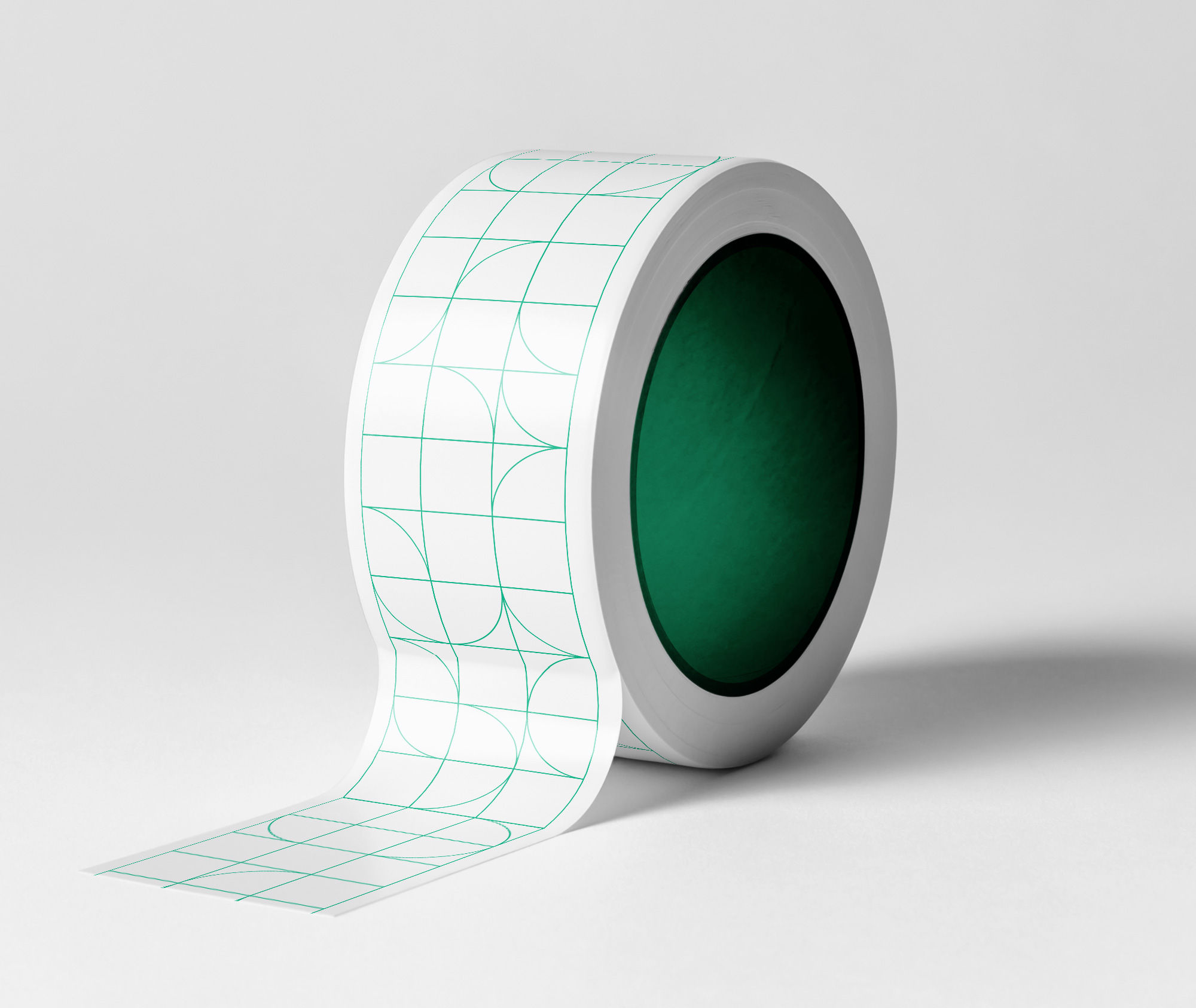
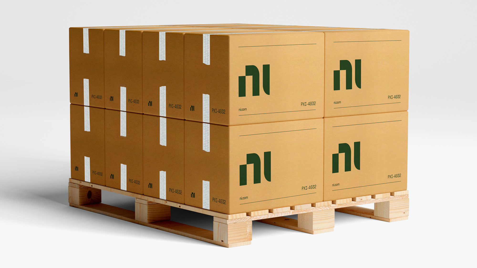
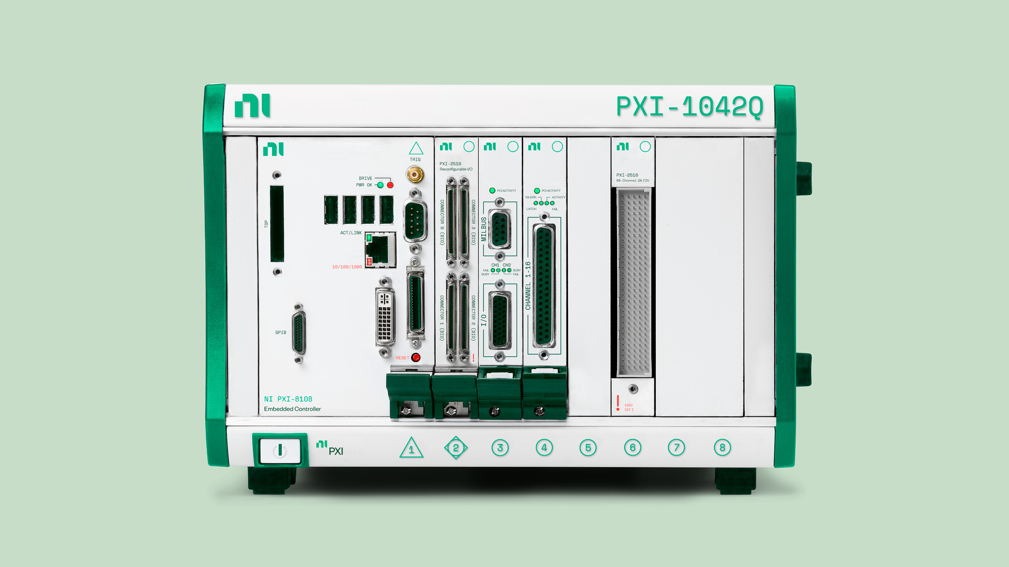
The mark reflects the connection of hard and soft, rationality and creativity, tech and people that sets NI apart. The letterforms are modular, geometric and precise. Designed for scale, the mark works equally well in signage or circuit board applications.
Gretel project page
In last week's post in the Noted section I wrote: "I like the new logo -- although I don't get the notch on the top-left corner of the 'n' -- as a graphic statement but it feels unfinished or like something is missing to it, which doesn't help that the name itself feels like a lot is missing." That first reaction mostly stands a week later but seeing the logo in more context certainly helps to assess its effectiveness and/or appropriateness which I didn't doubt would be positive given how nice the website is, which was the main application I had seen then. Long-winded way of saying, the logo is fine but it's finer in application on a system that emphasizes the curves and hard edges found in the logo.
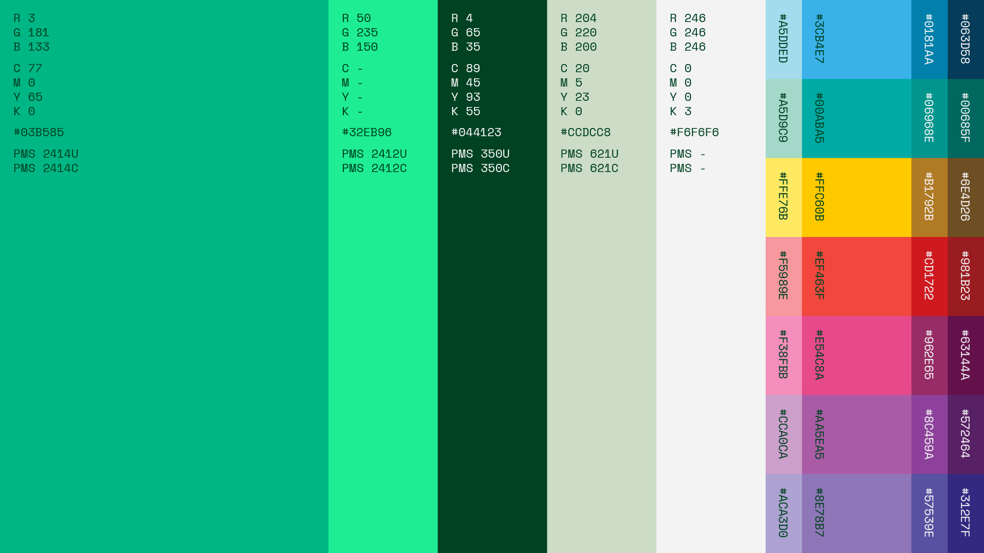
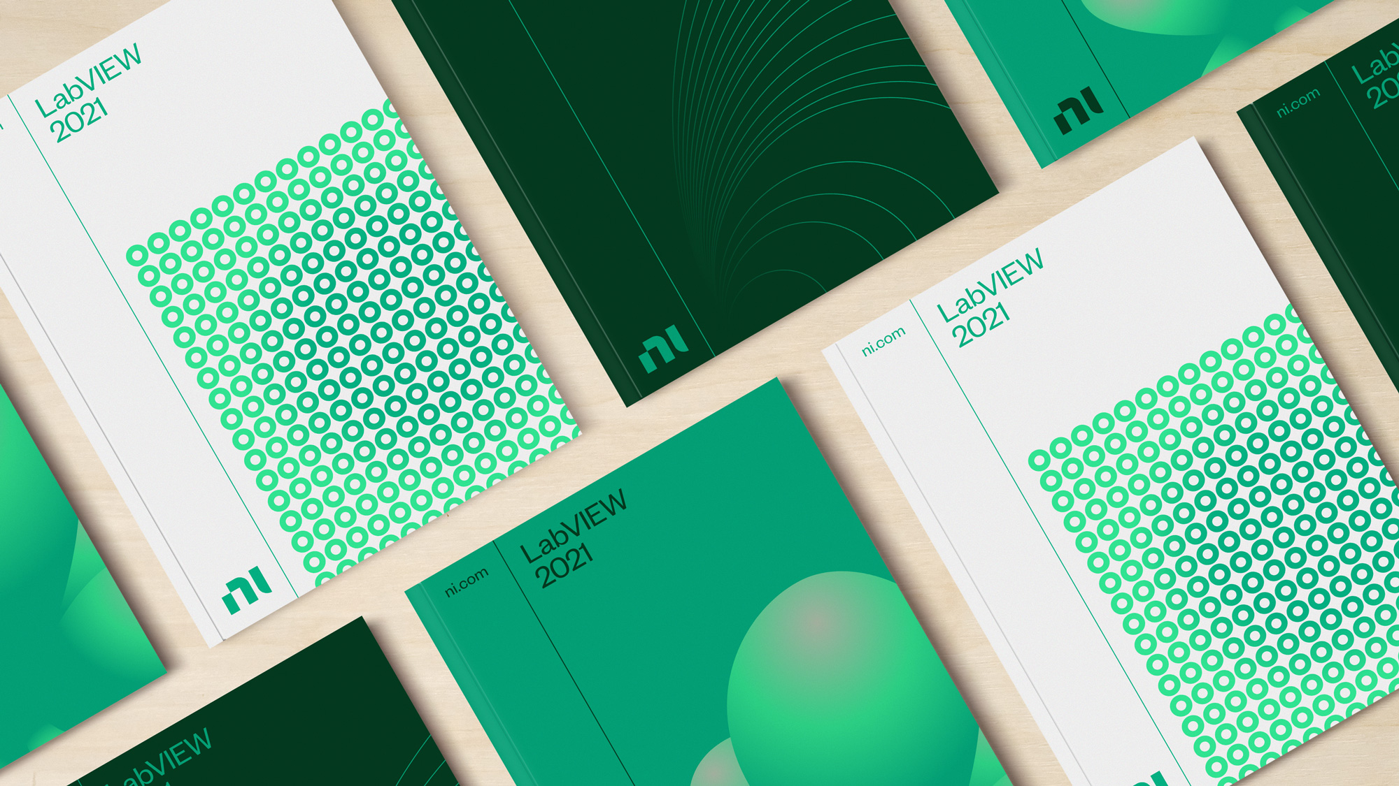
In a category oversaturated with safety blue and electric red, NI stands apart. The green signals a decisive new direction for the brand and evokes feelings of growth, change and sustainability, one of the grand challenges facing engineering today.
Gretel project page
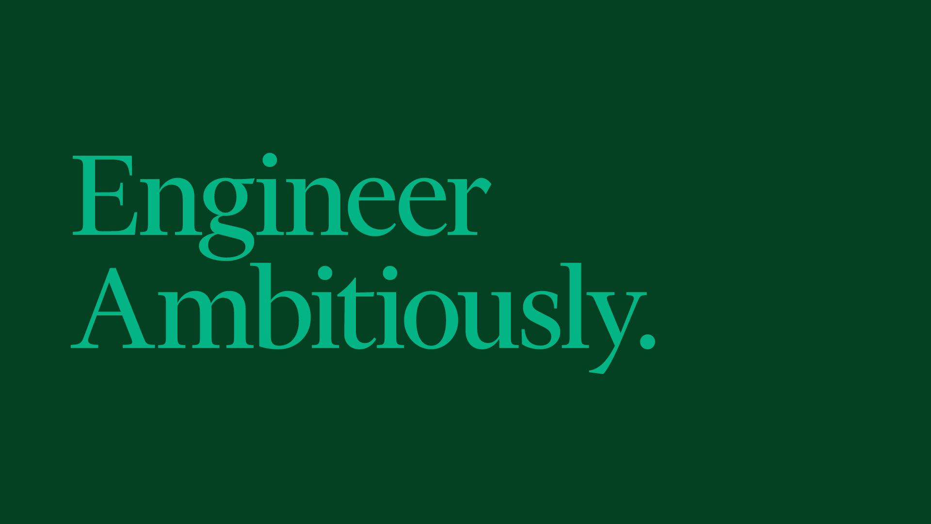
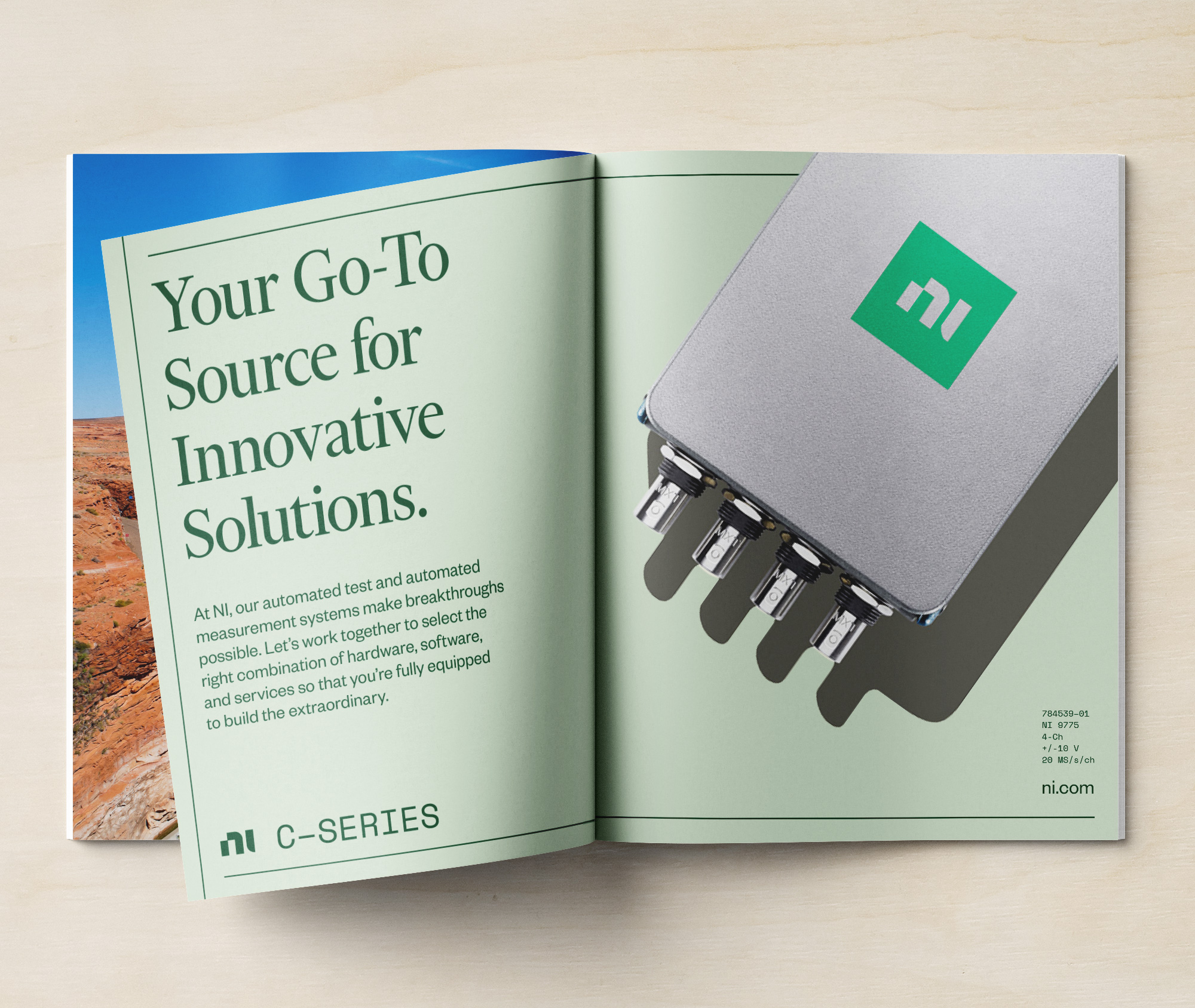
A suite of complementary typefaces extends the core brand idea of balancing precision and personality. Financier lends character to headlines and brand statements while Space Mono is used to call out technical specs, numerals and model numbers. Founders Grotesk is our workhorse sans, functional without sacrificing personality.
Gretel project page
We crafted a brand purpose calling on all innovators, from individuals to enterprises to Engineer Ambitiously. The higher-order purpose stands as a challenge to think bigger, aim higher, go faster. The brand's expertise in connectivity and adaptability allows NI to answer that call for its customers.
Gretel project page

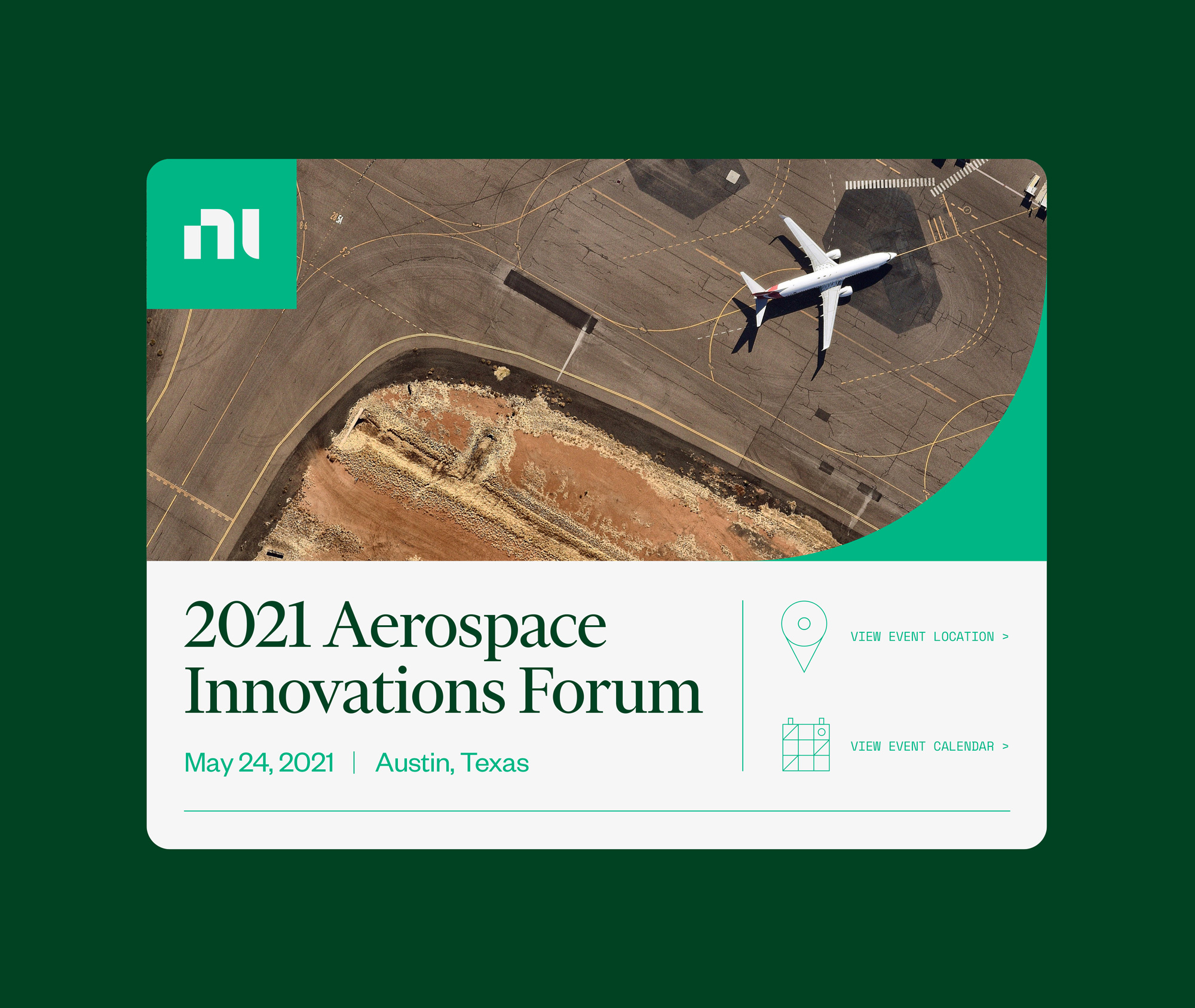
While photography plays a key role, concepts like autonomous driving, 5G communication and aerospace innovation can't always be captured in imagery. Spot illustrations and icons are rendered in a distinctive, interconnected visual language derived from the logo.
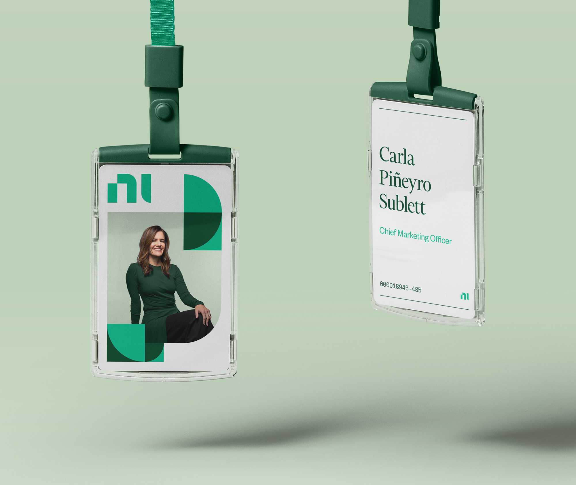
Portrait illustrations of NI colleagues were commissioned as well, another extension of the blend between precision and personality at the heart of the brand.
Gretel project page

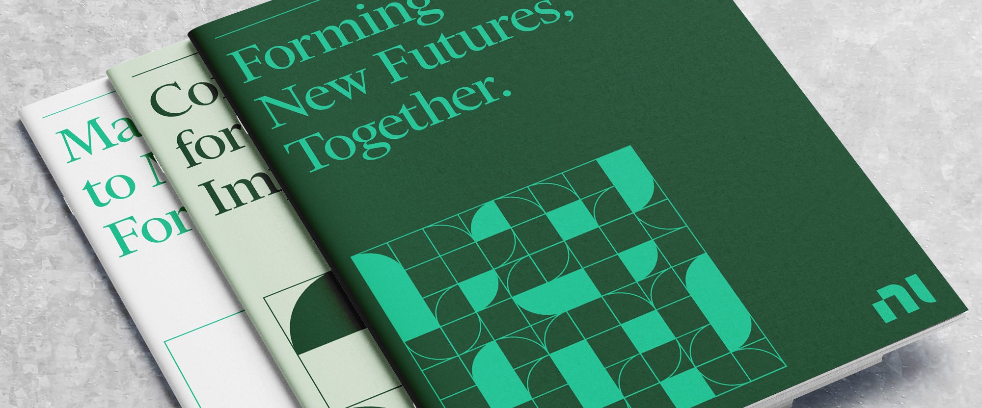
The elements of the identity are all quite nice, starting with the very strong typographic combination of Financier Display and Founders Grotesk by Klim Type Foundry with the free Space Mono in a supporting role. I'm not sure how many more corporations are going to go with the editorial magazine kind of look but it seems to be a growing trend -- it reminds me of Wolff Olins' work for McKinsey -- which I'm not opposed to at all but could eventually become played out. For now, this is another great example of how to do it right. The color palette is strong and I enjoy the combination of greens. The photography is solid and the illustrations are exciting, although perhaps they stand out a little too much.
The elements work together through a modular system that allows the grid to flex depending on the message and content. In stark contrast to the category, the design language maintains an editorial feel, and photography plays a key role by featuring the people, partners and impact of the innovations powered by NI, not just the products.
Moving beyond the tropes and traditions of the B2B test and measurement category meant approaching the brand like a dynamic B2C.
Gretel project page
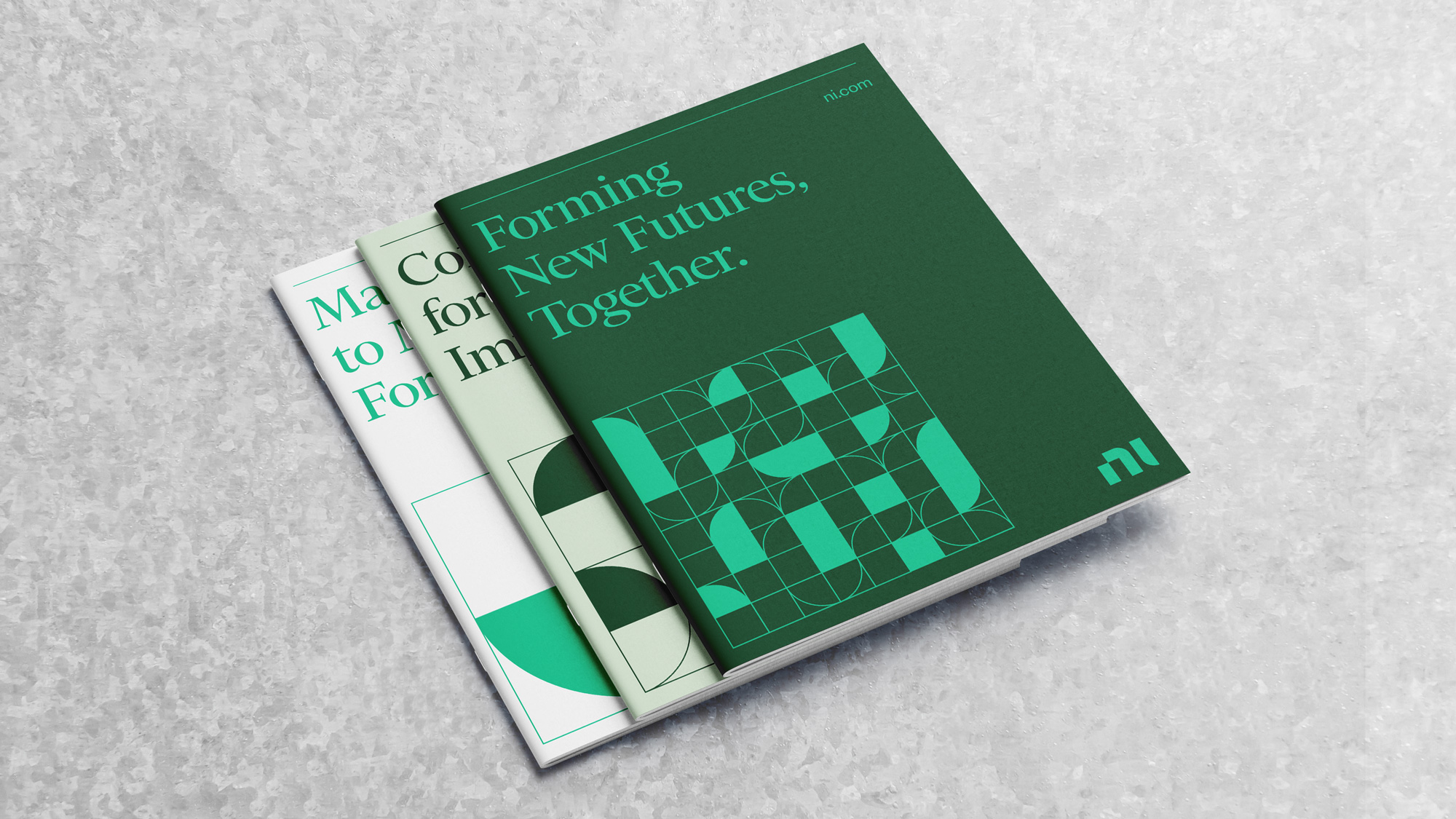
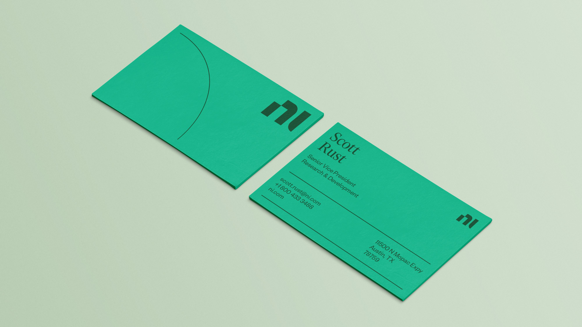
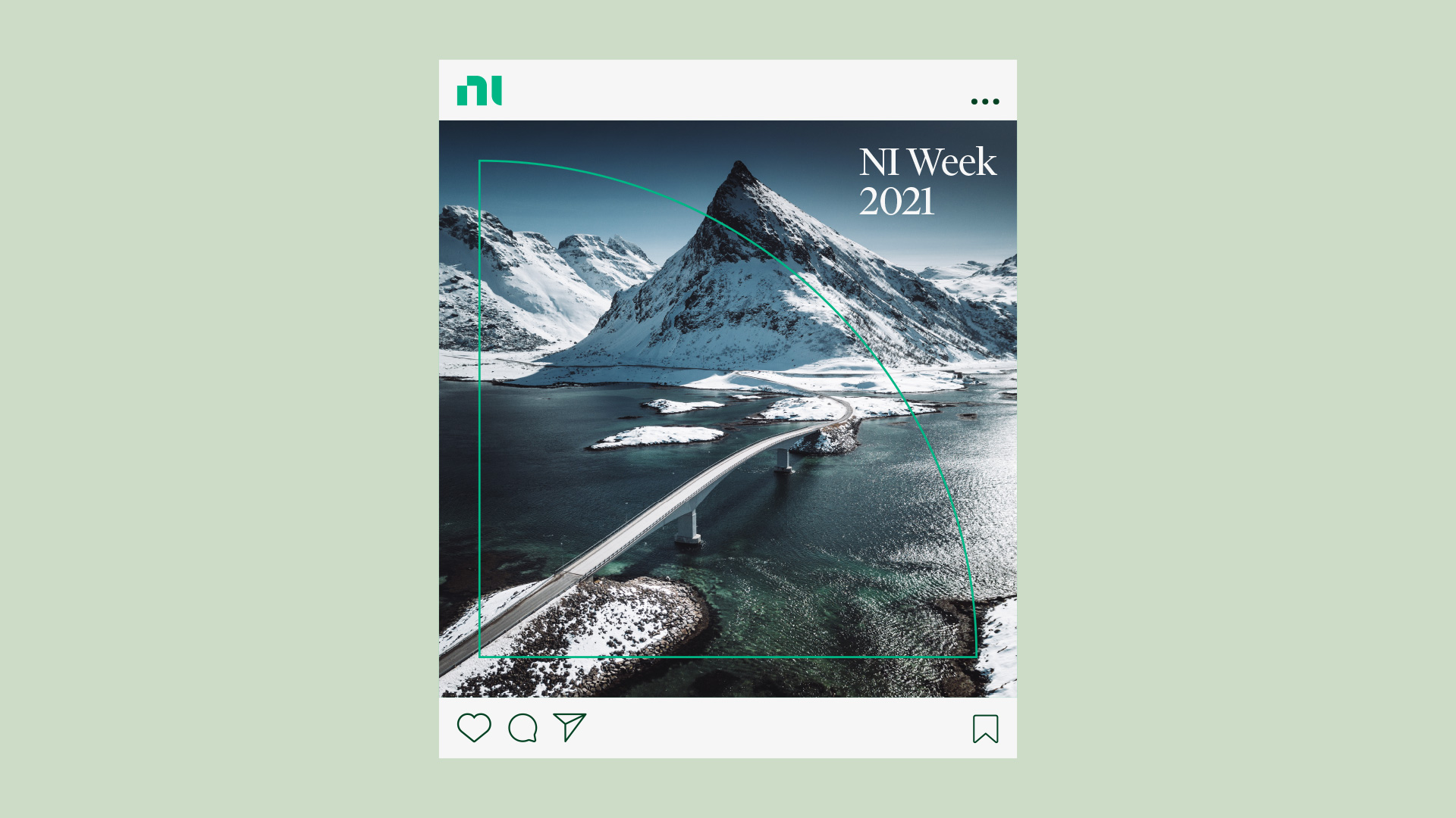
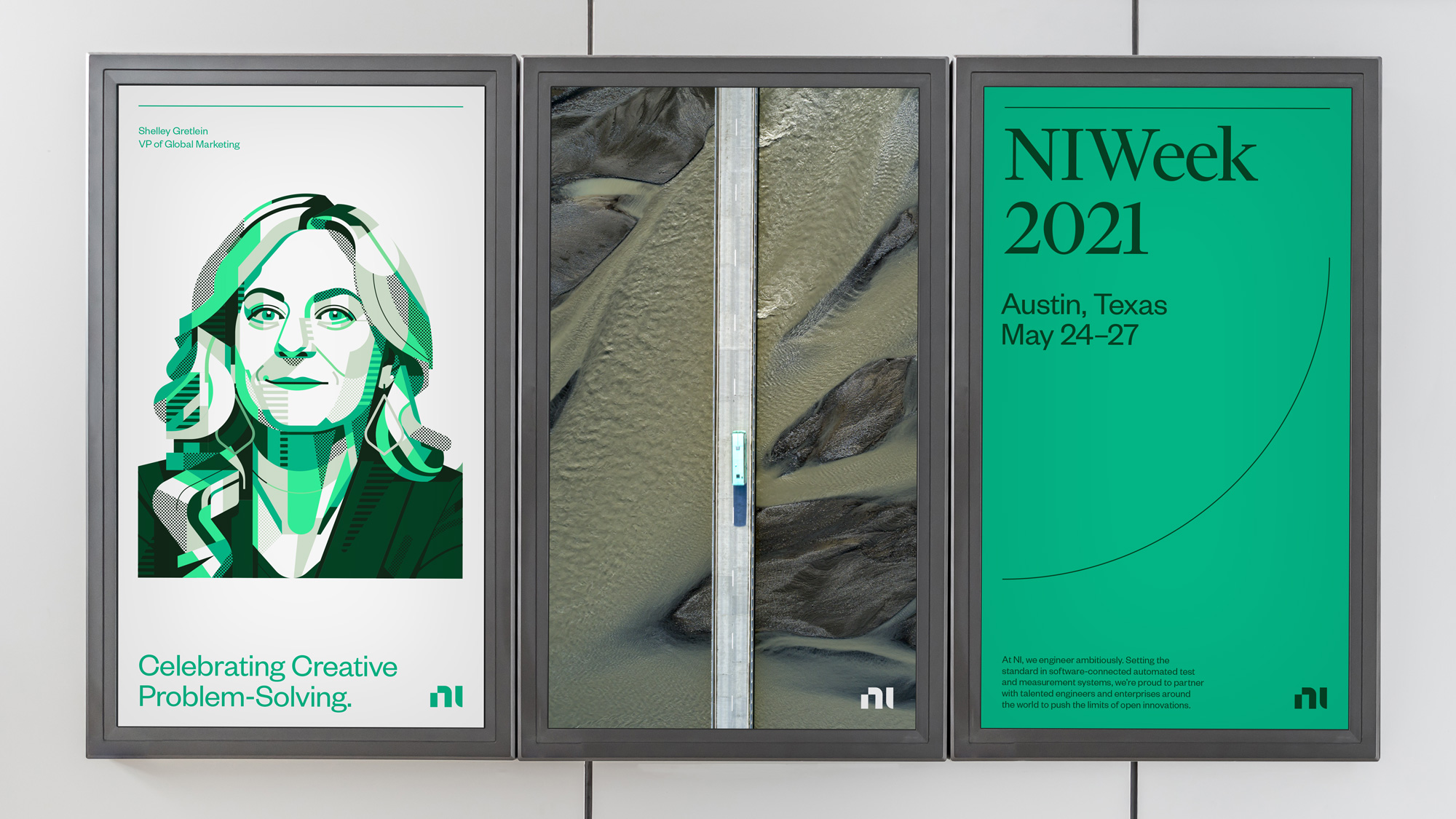
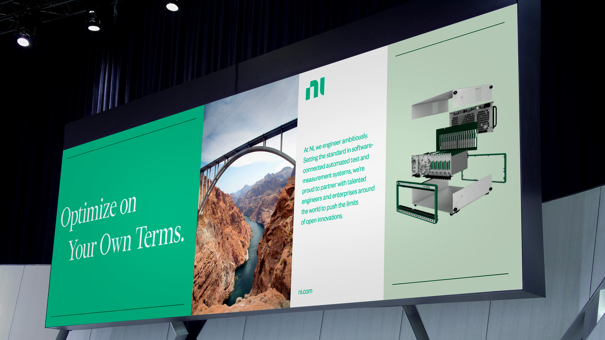
In application, all the elements come together very convincingly in fairly straightforward layouts that benefit from the well-chosen ingredients. The one element I don't quite like is the sole quarter-circle thin line that makes regular appearances... I always feel like something is missing from it, like an unfinished sentence. Throughout the applications the logo works almost like a punctuation mark, perhaps to a fault; I'm not one to usually ask to make the logo bigger but I think maybe increasing its presence in application would help in maximizing its minimal-ness.
Overall, this is all very well done and feels very appropriate for NI, making the company look hi-tech and cutting-edge but in a conservative way that adds reassurance to the fact that they are the company that reassures other companies they are engineering the right way.
|
 | Tweet