“No Strings Adaptâ€
(Est. 2020) "The Zappos Adaptive mission is to provide functional and fashionable products to make life easier. Zappos Adaptive is an online shopping experience offering clothing and shoes from innovative brands with unique features that address a variety of needs. The first-of-its-kind digital offering allows customers of all abilities the opportunity to purchase a single shoe or shoes of different sizes."
Design by
Eric&Todd (Columbus, OH)
Related links
Eric&Todd project page
Relevant quote
Before adaptive clothing was designed and produced commercially, the adaptive audience was modifying and building their own custom pieces. The sketch marks, used in the brand to highlight products and features, are meant to pay homage to the unique DIY culture.
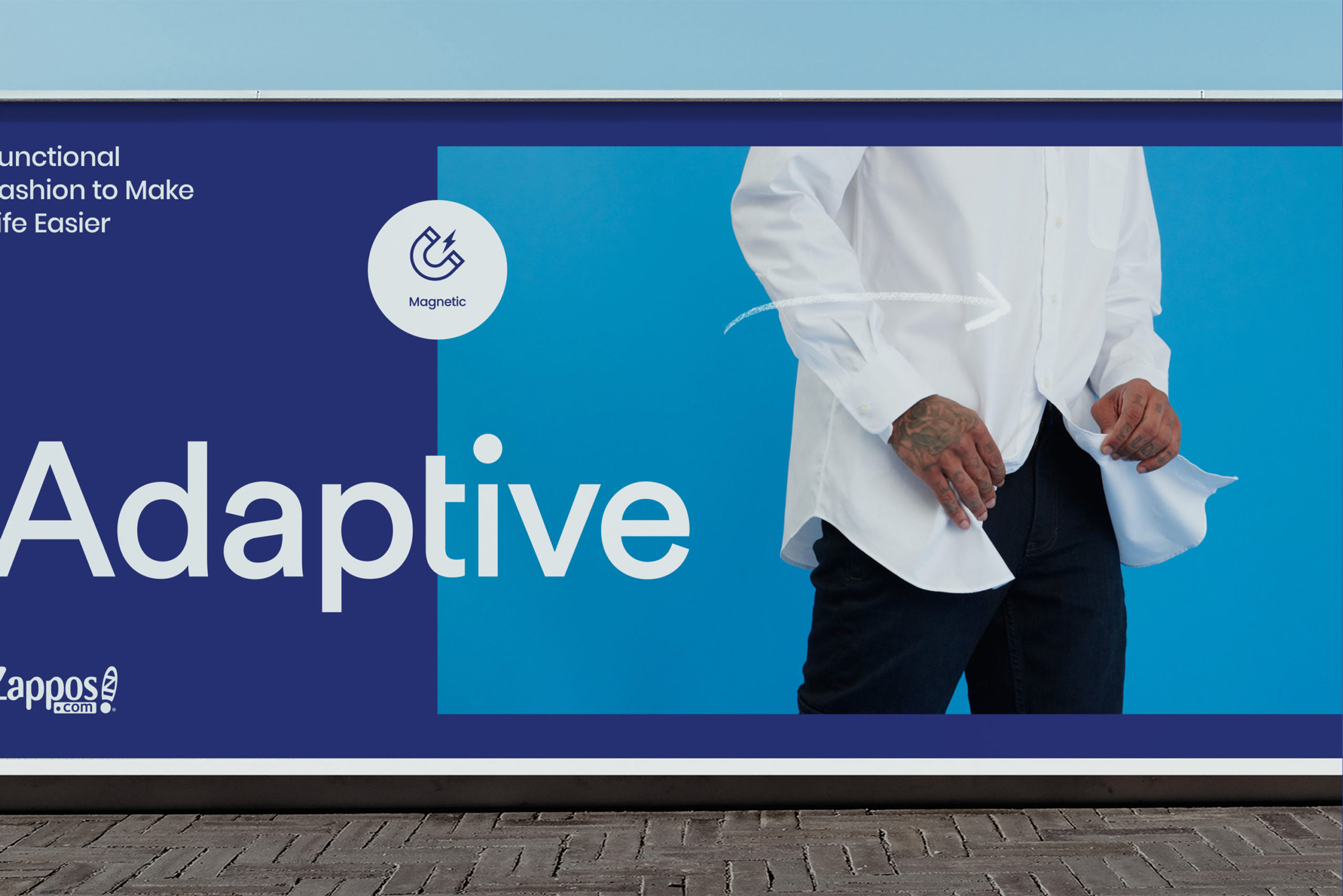
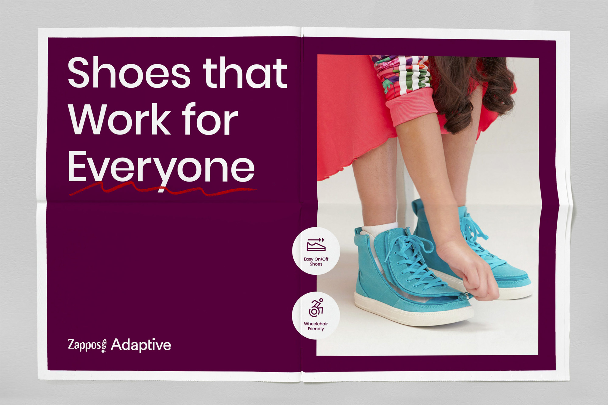
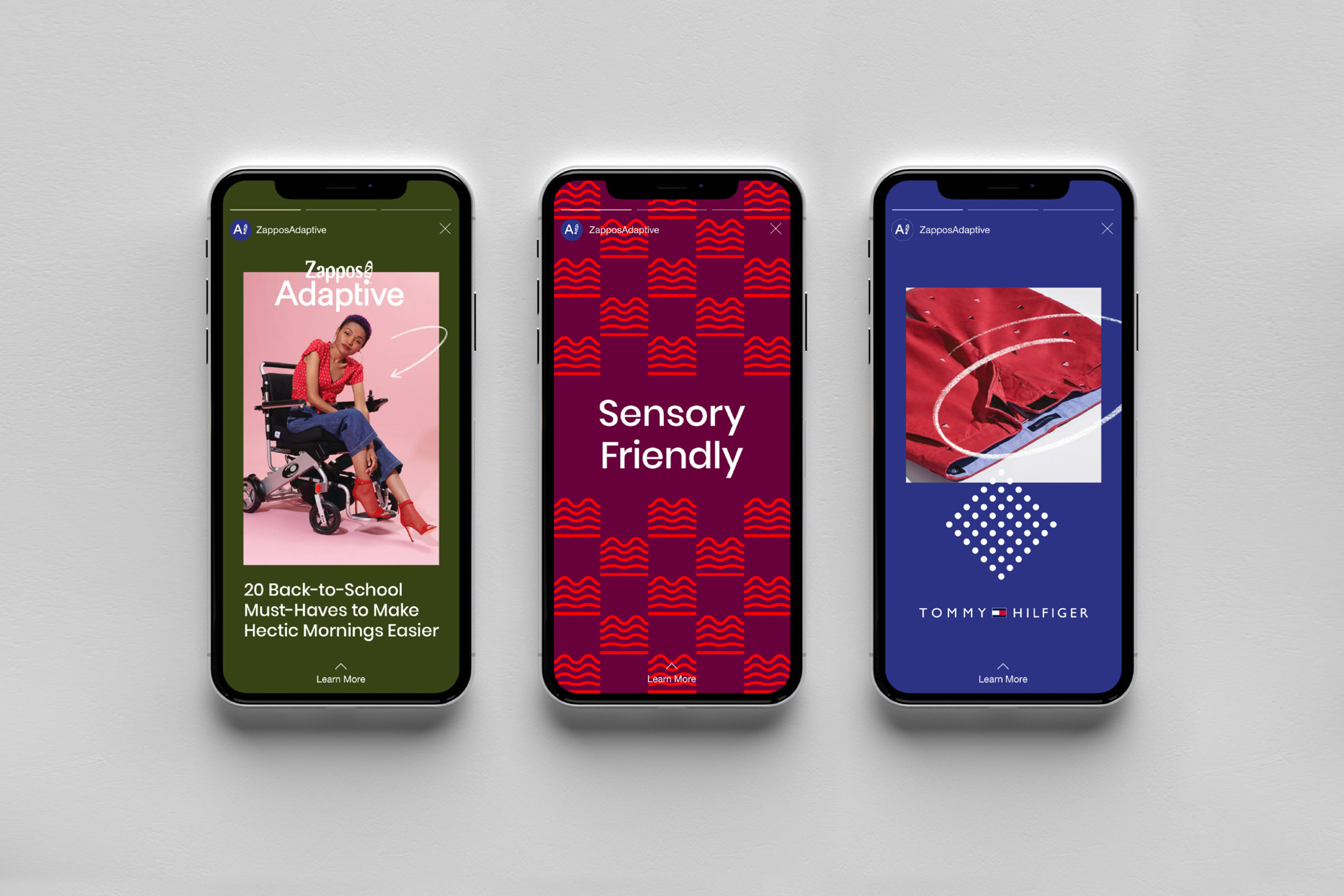
Until a few years ago, adaptive clothing was designed and marketed solely based on function. Zappos Adaptive brings innovative products to market in an elevated, upbeat, fashion-editorial style, enhancing the browsing and shopping experience for those who previously relied on impersonal purchasing experiences or DIY items.
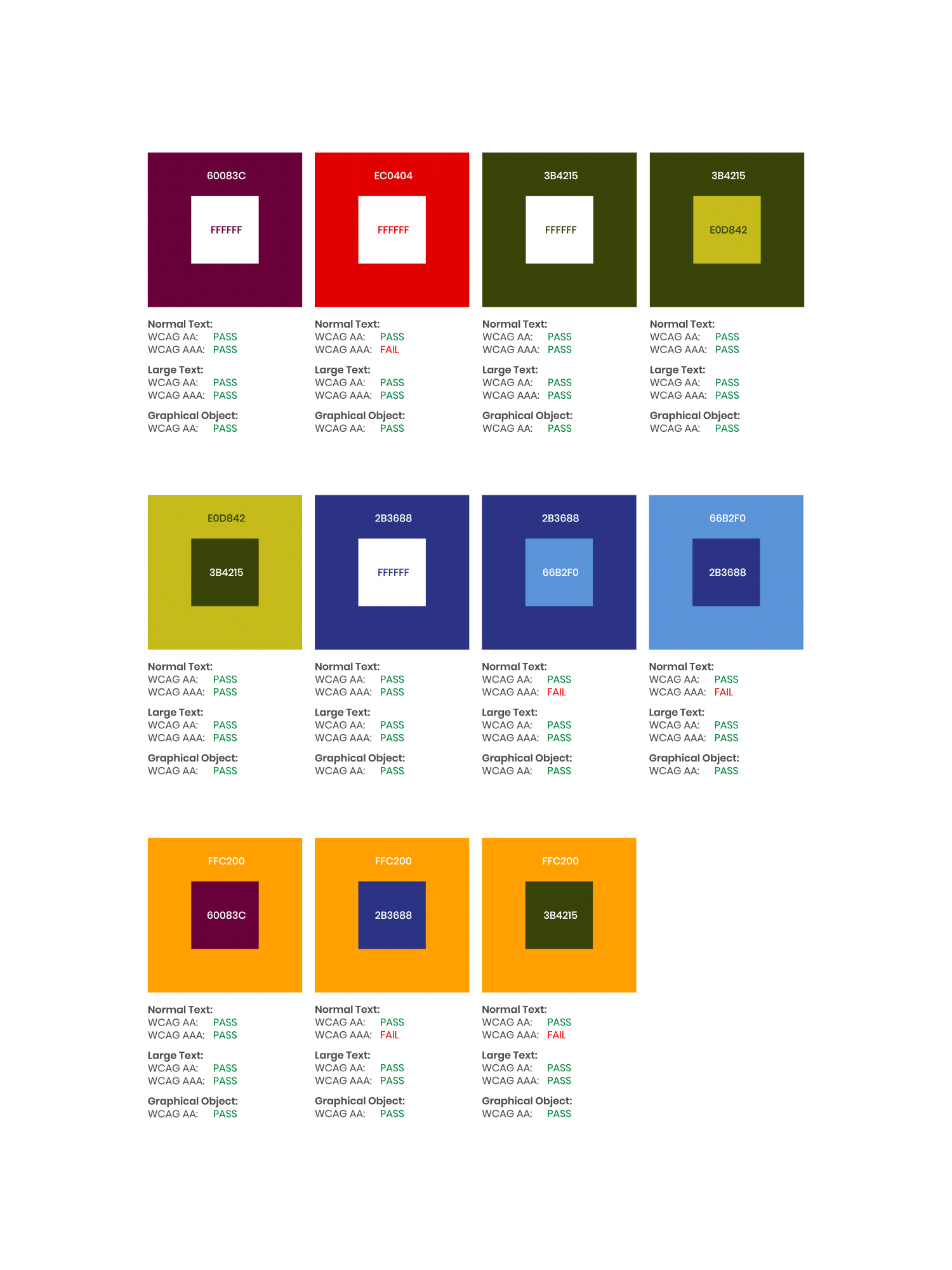
The adaptive color palette has been selected specifically so that all small text and background color combinations pass WCAG 2.0 level AA requirements. Background colors can be paired with certain text colors in the palette to ensure legibility while accent elements can use a more flexible color palette.
Images (opinion after)
Opinion
This isn’t a typical redesign as it’s not selling a particular product, service, or organization but a collection of apparel from various brands presented under the Zappos brand so there are a handful of odd considerations to take in. For example: including the Zappos logo, making sure none of the other brands are obscured, creating a distinct look-and-feel within the existing-look-and-feel of Zappos, and, most challengingly, portray different-abled bodies on par with typical apparel models and I think this all succeeds in a very subtle, uplifting way. Starting with the logo, for example, and perhaps I may be reading too much into it but I really like how in the new logo, the Zappos logo adapts to the word “Adaptive†instead of simply tucking it underneath the Zappos logo as the old logo did. It’s not a great logo by any means but when you have to include the Zappos logo into another logo no logo will ever be great and this does it quite elegantly. There is not much to the visual language or identity, which is good as I think it lets the great photography stand out as it basically says all there is to say: No matter what your body is like, there is a great product for you here. The hand-drawn sketchy marks are a little shy… perhaps they could be pushed more but, again, I think not being TOO design-y is a good thing in this case. The icon set is pretty great, bringing to life concepts that we don’t often think about as needing icons. Overall, a very pleasant solution to a difficult challenge.
|
 | Tweet